Reports Drilldown
Statusbrew’s Drill Down feature enables you to explore deeper insights within your reports — helping you uncover the story behind the numbers with just one click.
Instead of creating multiple filtered reports, Drill Down lets you zoom into a specific data point within a widget to view detailed information for that metric and its associated dimensions.
How does it work?
To drill down into a report, follow these steps:
Hover over a data value in the widget.
If drill-down is possible, the cursor will change to a pointer. Clicking the pointer will display a pop-up window. (If drill-down is not possible, the cursor will remain static, and clicking will have no effect on the screen.)
A list of available dimensions will be displayed to allow you to drill down further into that metric, so select any dimension you like.
The drill-down results will be displayed on the right, in a table chart based on the selected metrics and dimensions.
Any metric filters or conditions applied to the original widget are automatically carried over to the drill-down view.
You can also export the widget from the drilldown dialog. Click at the top right corner of the widget & select:
Export as CSV
Download widget image
To change the widget visualization, click the current visualization icon in the top-right corner of a widget and select a new visualization from the dropdown menu.
You can also open post and conversation details in the side peek from the drilldown charts by clicking the post or conversation.
Supported Chart Types
Drill Down is available across the following chart types in Statusbrew:
Area
Bar
Column
Heatmap
Line
Map
Pie
Spline
Stacked
Treemap
Wordcloud
Summary Table Charts
Number Charts
2D Table Charts
Example Use Cases
Here are a few examples to help you understand how Drill Down works in reporting:
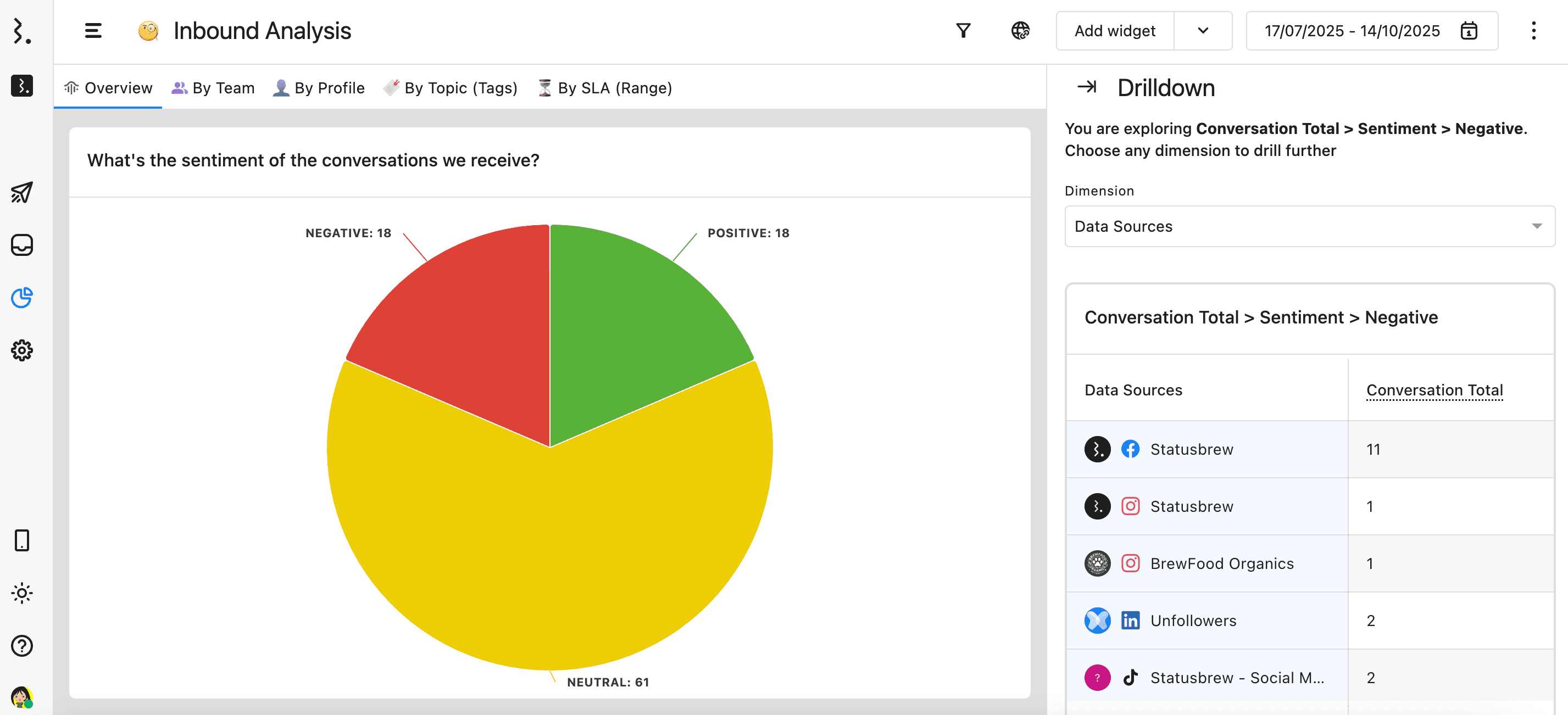
Conversations by Sentiment (Pie Chart)
Click on the slice representing Negative Conversations to see exactly where negative feedback is coming from.
By drilling down by dimensions such as Data Source or Date, you can quickly identify which platforms or time periods are driving the most negative sentiment — helping your team act faster to address issues or optimize communication strategies.
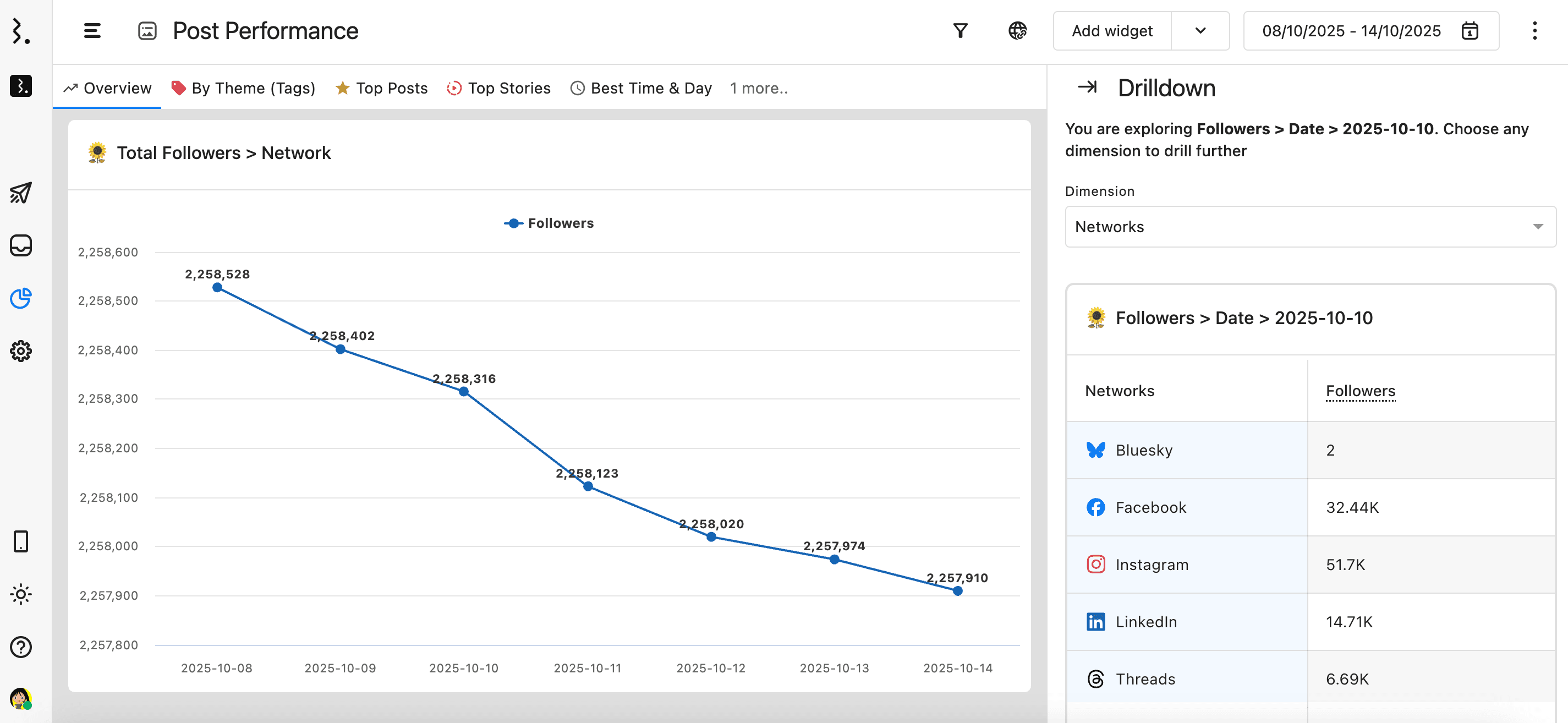
Followers by Network (Line Chart)
Clicking on the data point for Facebook reveals a deeper breakdown of follower growth over time.
You can drill down by Date to analyze when your audience grew most significantly and correlate spikes with specific campaigns, posts, or events — giving you a clear understanding of what drives audience growth.
Drill Down in Non-Chart Widgets
In addition to visual charts, Drill Down in Statusbrew Reports also works with non-chart widgets such as summary tables, number charts, and 2D table charts.
Summary Table Charts
Summary Tables display a consolidated view of all selected metrics. The first column lists each metric type along with its current and previous values, helping you quickly identify performance trends.
You can drill down on any metric by clicking its name (the first cell of the row). This opens a detailed breakdown across available dimensions such as network, profile, or date — allowing you to see exactly how each metric value is distributed.
Example: Clicking on “Engagement Rate” in a summary table can show how engagement varies by platform or content type, giving you instant clarity into performance drivers.
Number Charts
Number Charts provide a compact view of selected metrics, displaying each one as a separate data block with its current and previous values.
Users can drill down into any metric block by clicking it. This opens a side-peek dialog with a detailed breakdown across available dimensions. It’s a quick, visual way to move from high-level KPIs to granular data — without leaving the report.
Example: Clicking on “Total Followers” in a Number Chart can reveal the distribution of followers across networks or countries, helping you identify audience growth patterns at a glance.
2D Table Charts
2D Table Charts include at least one metric and two dimensions — one represented by the first column and the other by the first row.
Users can drill down on any value by clicking a cell in the first column or first row to further explore that metric against the selected dimension.
Example: In a 2D Table where the first column represents Data Sources and the first row represents Networks, clicking a data source or network cell drills deeper to show how performance varies across those attributes.
Why Use Drill Down?
For agencies and analytics teams managing multiple brands or clients, Drill Down offers several key advantages:
Instant insights — access deeper layers of your data without leaving the report view.
Smarter analysis — understand the context behind spikes, dips, or anomalies.
Client-ready transparency — show clients exactly what’s driving key results.
Time savings — skip manual filtering and report duplication when investigating trends.