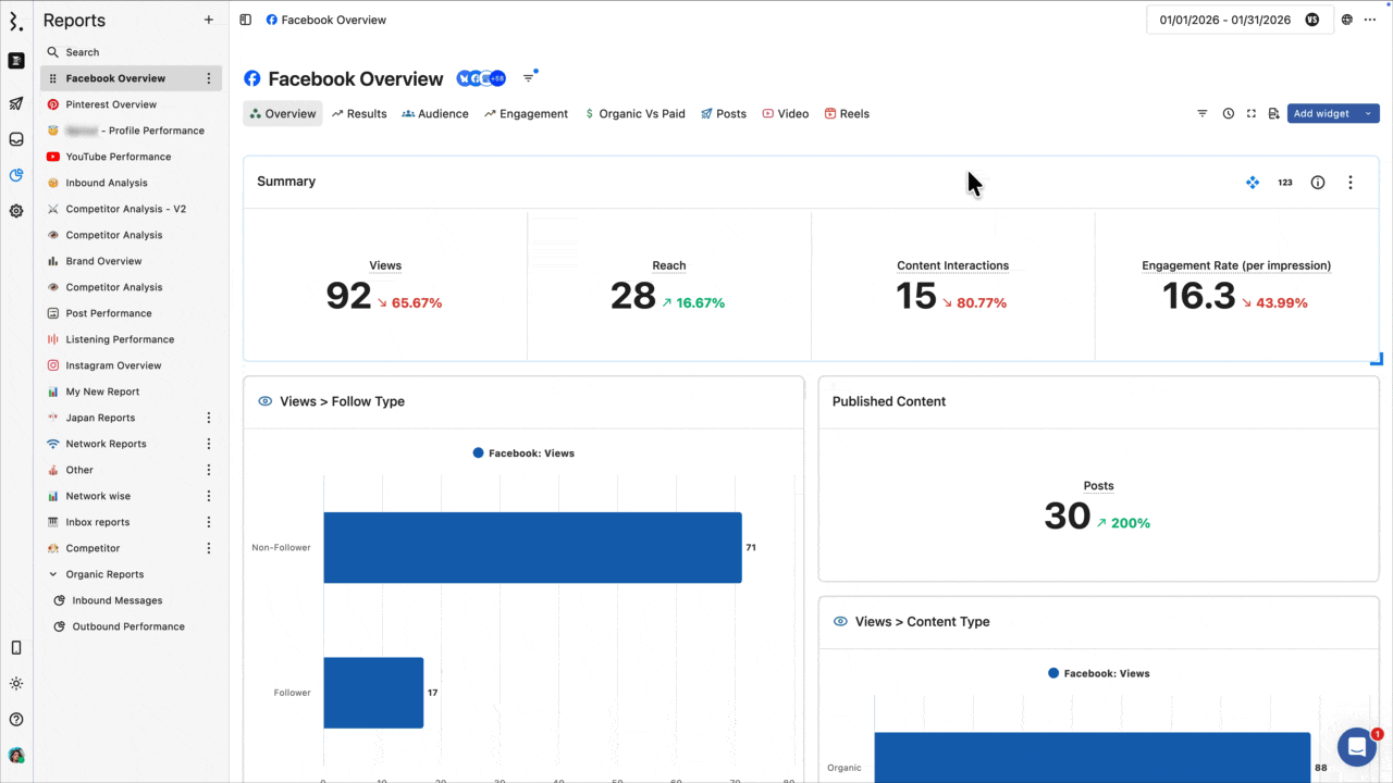
What Is A Widget?
Widgets are the building blocks of reports that combine specific data metrics with flexible visualizations. Add dimensions and filters to gain deeper insights into your social media performance.
What is a widget?
A widget is a combination of 1) metrics such as engagement and reach, 2) visualization types such as charts and pie charts, 3) dimensions such as performers and networks, and 4) filters to display data in an easy-to-understand, visual format.
Statusbrew is highly customizable. These widgets are essential for performance analysis. See also Adding Widgets to a Report.
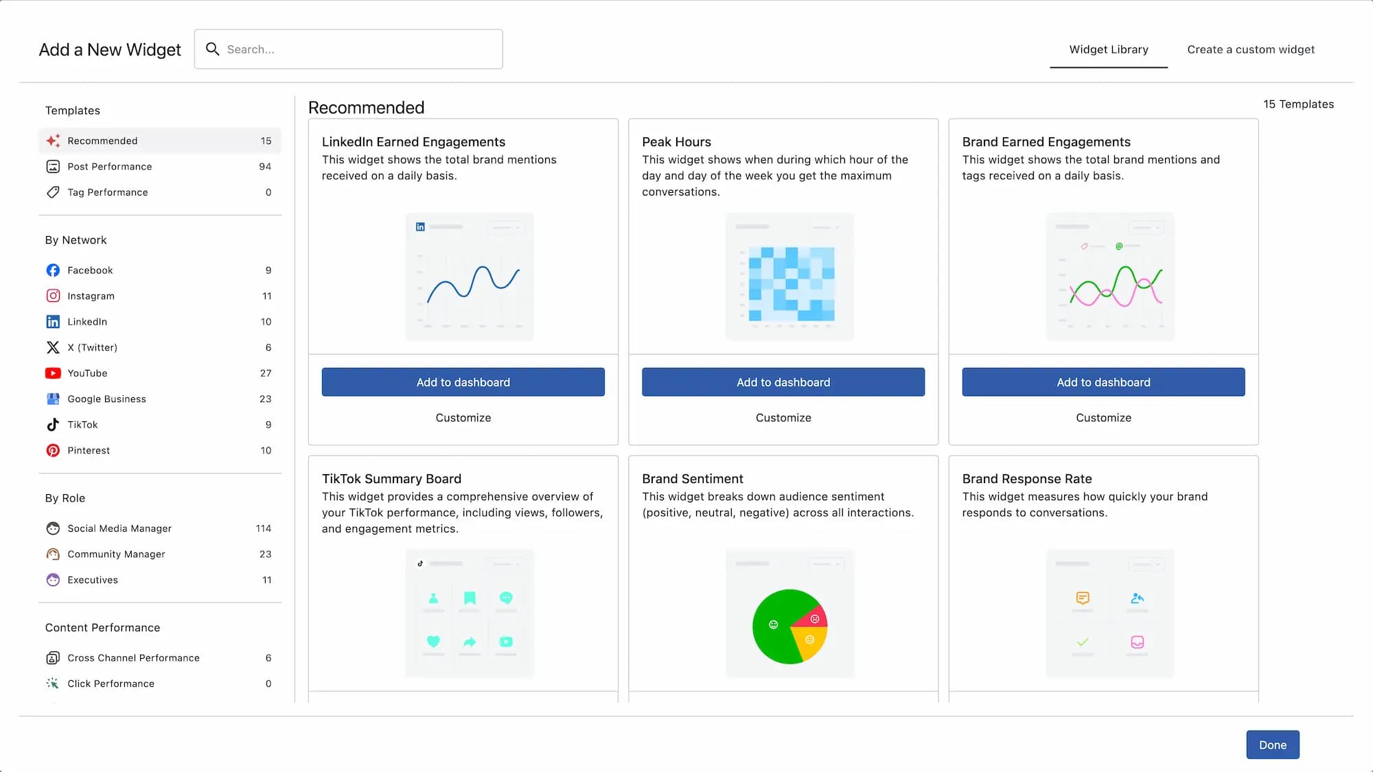
Available widgets
Statusbrew gives you unlimited social media marketing data. Here are some widgets you can add to your.
Number of followers
Displays the trend in the number of followers over a specified period. Depending on the network, you can customize it to perform detailed analysis by gender, region, or job title.
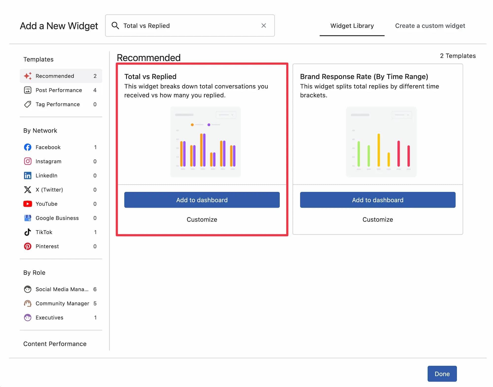
Number of conversations and conversation replies
Shows the total number of conversations received and replies to them. You can also add dimensions, such as by profile or by date (discussed below), to get a more refined report and find customer service issues.
Top Posts
Shows the top posts for the selected time period for the selected network.
Brand Acquisition Engagement
See the total number of mentions and tags for your brand by day.
Google business search keyword list
Based on the number of search keyword views, it will list what keywords Google users are using to reach your business. There are also Google Business-specific widgets for the number of reviews and average star rating.
Useful template widgets
Statusbrew offers a wide variety of widgets, and the ones above are just a few. While having so many options can be appealing, choosing among them can be difficult. That's why Statusbrew offers template widgets!
Template widgets are widgets with pre-set metrics and dimensions for situations where analysis is needed. There are templates for each network, such as one to analyze how quickly your team responds to conversations or another to check the number of TikTok followers by country.
For example, the "Number of conversations and number of replies to conversations" widget introduced earlier is available as a template called "Total number of conversations vs. number of replies" in the widget library, so you don't have to create it from scratch.
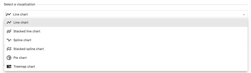
Widget Visualization
Statusbrew's widgets offer 22 visualizations to help you present your data more effectively based on your metrics. By choosing the best visualization and setting the right dimensions and metric values, you can easily understand your data, spot trends, and make informed decisions.
Widget Metrics and Dimensions
Widget metrics are the data values you want to track, such as reach, engagement, and the number of posts. Statusbrew currently offers 250+ metrics.
So what is a dimension? It's an angle used to analyze the content of a metric more deeply. For example, it's like an additional layer of detail added to a metric, such as categorizing data by day or month.
Dimensions give you reports that show the data most relevant to your business needs.
Case: Analyzing posting frequency
The metric is "Post Count," and the dimensions are "Date" and "Network".
This shows the number of posts per day for each platform. You can change the visualization by clicking the icons at the top of the preview window on the right side of the interface.
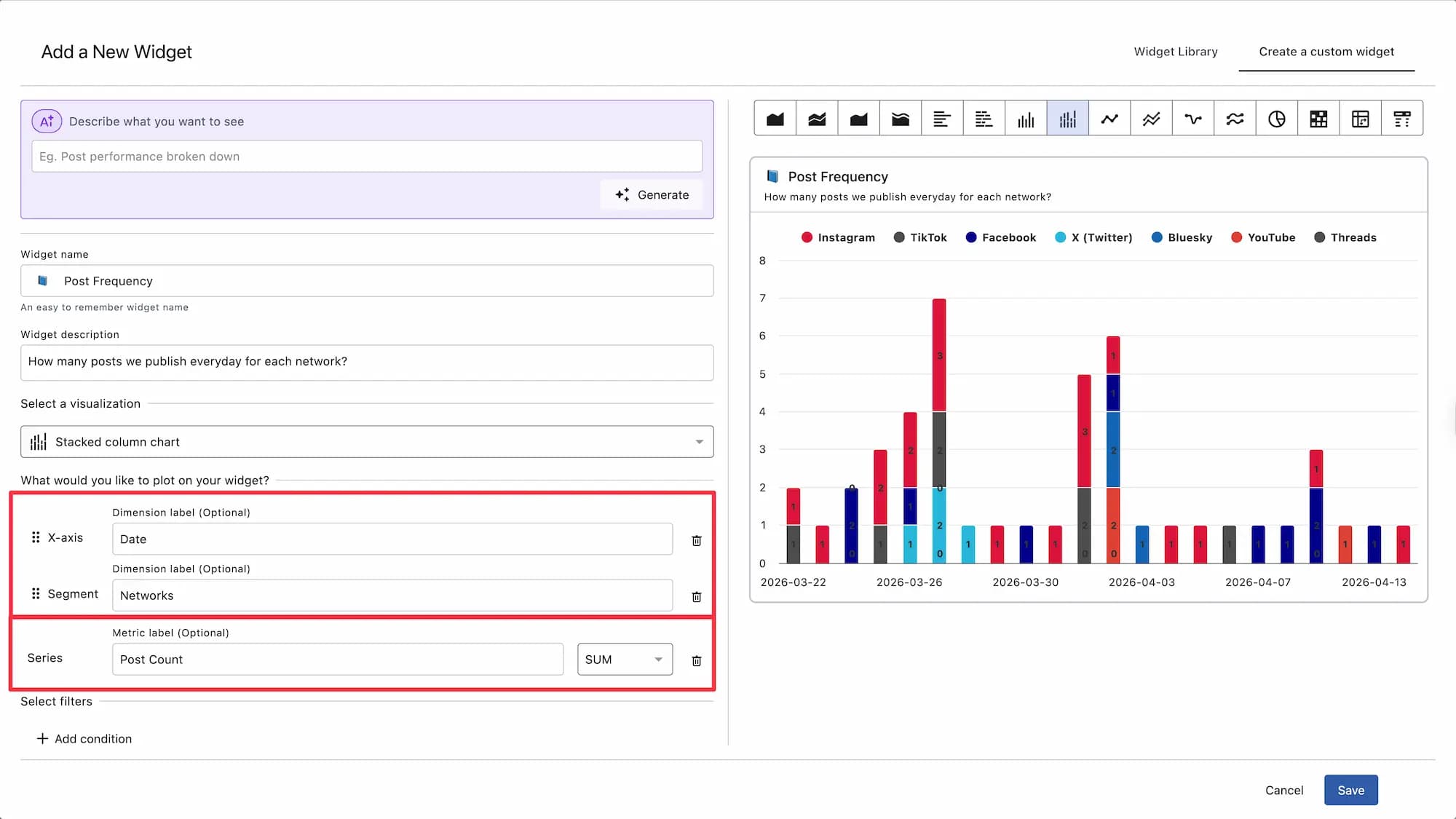
Combining metrics and dimensions in this way allows you to create highly customizable reports and analyze the performance of multiple metrics simultaneously.
The dimensions change depending on the metric you select.
While it is possible to apply multiple dimensions or metrics to a single widget to slice and dice your data, we recommend choosing your metrics and dimensions carefully to avoid a report that is either unfocused or difficult to understand.
Note: Post metrics and page-level metrics (Engagement, Impressions, Reach) cannot be combined in the same widget. If you're building a post-level widget, always select metrics from the Post category.
Add a filter
Adding filters, such as networks, allows you to dig deeper into your data, analyze specific datasets, and discover insights relevant to your objectives. You can also incorporate Planner Board filters to get a more detailed report tailored to your objectives. You can also add pre-built custom data attributes to create even more targeted reports.
Case: Analyzing the number of posts by tag
1. First, select the pie chart in the visualization. Next, select the "Post count" as the metric and add "tag" as the dimension. This will create a pie chart showing all posts by tag.
2. Now we'll add another filter and select relevant tags.
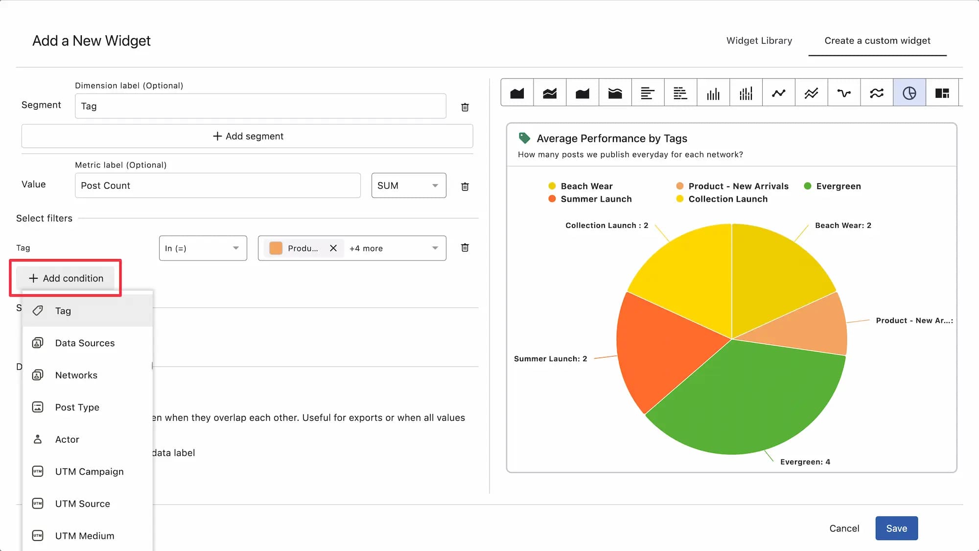
Filters are metric-specific, so the number and type you see will vary depending on the metric you have selected, but here are some of the filters you can add:
Periods such as days, weeks, months, and years
tag
Data Sources and Networks
Post Type
Executor
UTM parameters
Post-related information (such as number of likes and comments)
Profile activity (e.g., CTA clicks)
sentiment
You can also add custom data attributes that you create.
Unnecessary filtersYou can delete them by clicking
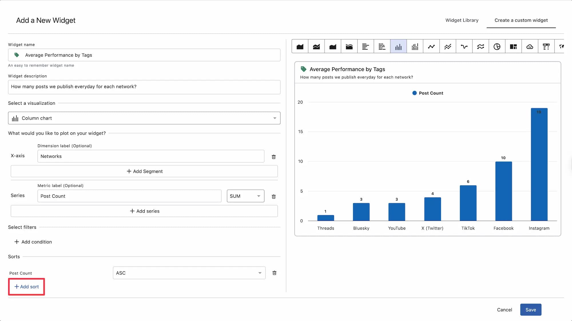
Add a sort
Get a more organized report by sorting your data by post count, post type, network, etc. Sorting is also a metric-specific option, so the type and number of results you see will vary depending on which metric you select.
For example, if you select Posts as the metric, Network as the dimension, and a column chart as the visualization, data for each network will be displayed regardless of whether the value is high or low.
If you add the number of posts to the sorting and sort in descending order (DESC), the networks with the most posts will be listed from left to right.
For table charts: Specify the number of rows to display
For table charts, you can specify the maximum number of rows to display. You can choose from the following values: 10, 20, 50, 100, 250, 500, and 1000.
This is a useful feature when you want to compare a large number of posts.
Define the widget settings
You can also further customize the widget. When you use Statusbrew, you'll see this as "Define Widget Configuration".
This is mainly an option to fine-tune the widget display. You can set a goal line to visualize your goals, or, for graphs with large values, set the interval (step size) to make the numbers easier to read.
This option is specific to visualizations, metrics, dimensions, filters, and sorts, so what you can set will vary depending on the type selected.
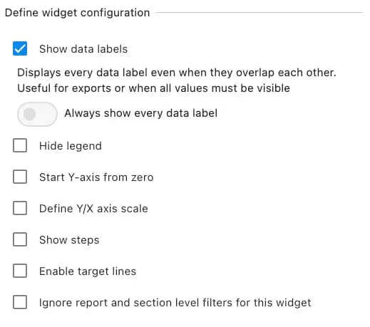
Specifically, you can define the following items. The preview window on the right side of the screen reflects your changes in real time, so you can work while checking the actual layout.
Include Data Labels
Display data values (numbers) (uncheck to remove the numbers)
Hide the legend
Suppresses the display of the metric name
Start the Y axis at zero
Select this when you want the Y axis to start from 0 in a graph consisting of an X axis and a Y axis.
Define the Y-axis/X-axis scale
You can select the minimum and maximum limits and the Y-axis interval (step size) for each. (For example, when the value is large, you can make the graph easier to read by increasing the interval between the Y-axis values.)
Viewing Graphs
For graphs and charts where values are changing, you can display steps at the change points, and you can choose to position them on the left, center, or right.
Apply target line
Add the goal line you want to achieve. You can choose the name, goal value, and the type and color of the line that shows it. You can also set multiple goal lines.
Ignore report and section-level filters for this widget
If you applied filters when creating a report dashboard or adding sections, check this box to disable those filters in the widget.
Hide previous period: Hides the previous value if there is a change in value (if shown, it will be displayed as a percentage)
Show the previous period as a number
Check this to display the previous value as a number instead of a percentage.
Show all numbers
Conditional Formatting
This feature automatically changes the color of cells or rows based on specific values, making it easier to quickly identify data and patterns. This feature is available when you select the table chart or number chart data method.
Since you can set more than one value for a single metric, by setting the target and minimum target values in the conditional format, you can immediately see how the performance for that period compares to the target.
Now let's take a look at how to use it.
Click the three dots in the top right corner of the widget and select Set Conditions.
Click the + icon in the top-right corner.
Select the metric you want to apply from the dropdown.
Next, you can define the value by entering a specific number and selecting one of the operators: Equal to, Greater than, or Less than.
Finally, choose a color.
For example, to set "When the "Reach" is less than 100, display in Red",
Metric: Reach
Color: Red
Operator: Less than
Value: 100
Finally, click Create, and you're done.
Customizing Widgets
You can resize and reposition it within your dashboard for a better look.
To resize a widget:
Hover over the widget you want to resize
Click and hold the icon in the bottom right corner to resize the widget to your liking.
To change the position of a widget:
Hold the cursor over this mark in the upper right corner of the widget.
Hold and drag to change the position as you like.
Drill down
The widgets you create may support drilling down.
For example, if you have a chart showing the number of messages received by day, you can drill down to see the number received by time of day for a deeper analysis.
Learn more about Drill Down