Widget Visualization (Chart Type)
StatusbrewThe advanced analytics currently offers 22 rich visualization patterns.
Data visualization is the process of presenting data in a visually appealing way, such as through charts or figures . Even if the data itself is the same, the optimal visualization will vary depending on what you want to analyze and how.
This page introduces the 22 types of visualizations and their respective characteristics.
Before introducing each type
Statusbrew's analytics are made up of widgets , which are questions you ask of a single piece of data.
For example, let's say you want to analyze "which day had the most impressions this month."
The corresponding data is
The answer to the question you want to know
Data properties
How to present and communicate data insights to colleagues and clients
The visualization will vary depending on which one you want to emphasize.
And it's easy to imagine that the appropriate display format for the above analysis would be different from if you wanted to know the breakdown of follower counts on Facebook, Instagram, X, and LinkedIn.
As you use the reports, you'll find the best visualization for your needs. Statusbrew's visualizations are flexible, so while we encourage you to think outside the box, it's a good idea to start with common chart types.
When you actually set each type in Statusbrew, you will need to enter "metrics" and "dimensions." Those who use Google Analytics will be able to imagine this, but the terminology may be difficult to understand.
Be sure to read about how to create widgets and reports , as this will give you a much deeper understanding of visualization!
22 Widget Visualizations (Chart Types)
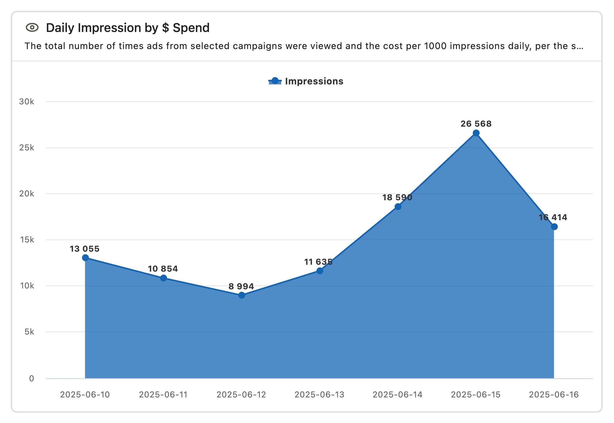
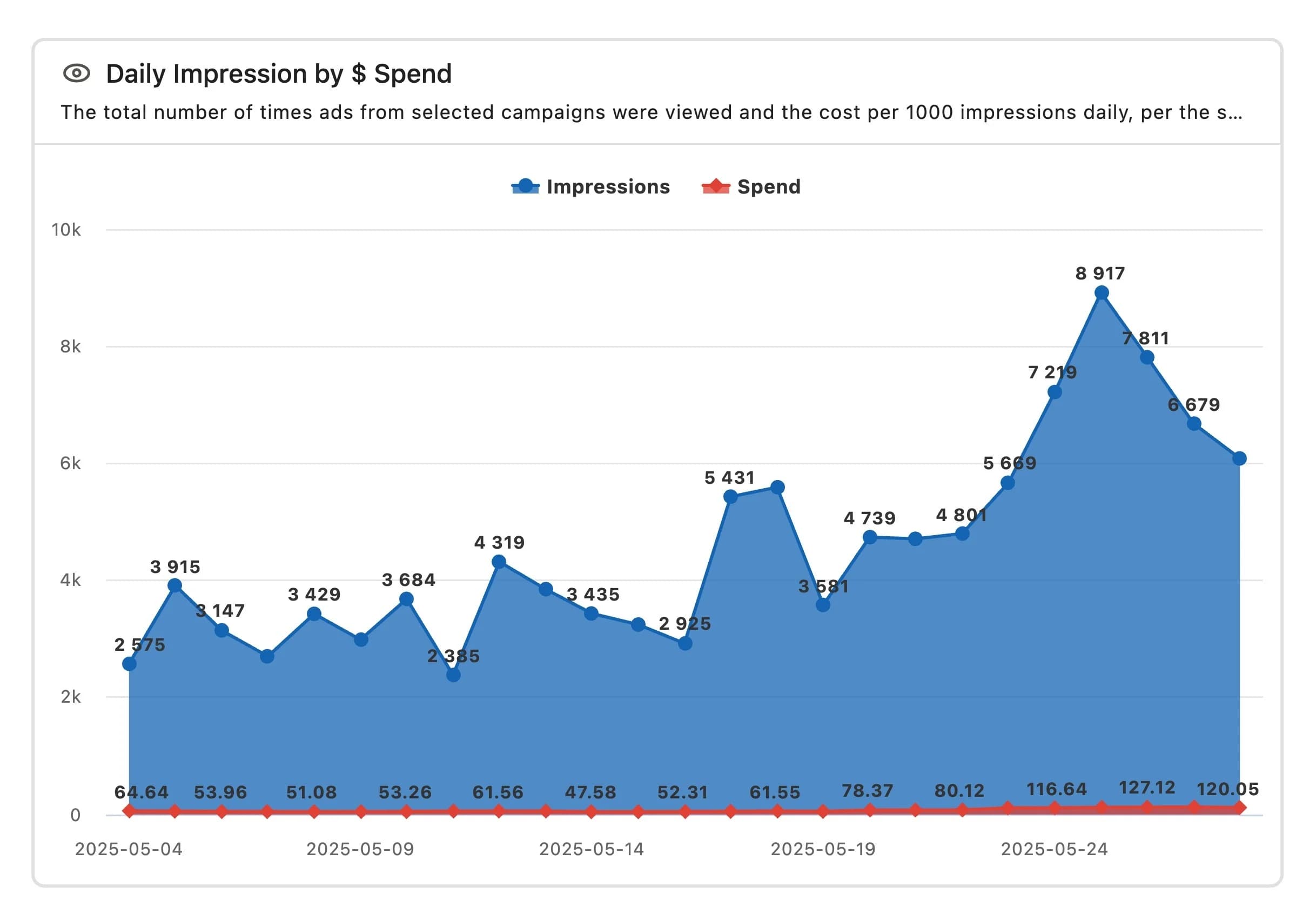
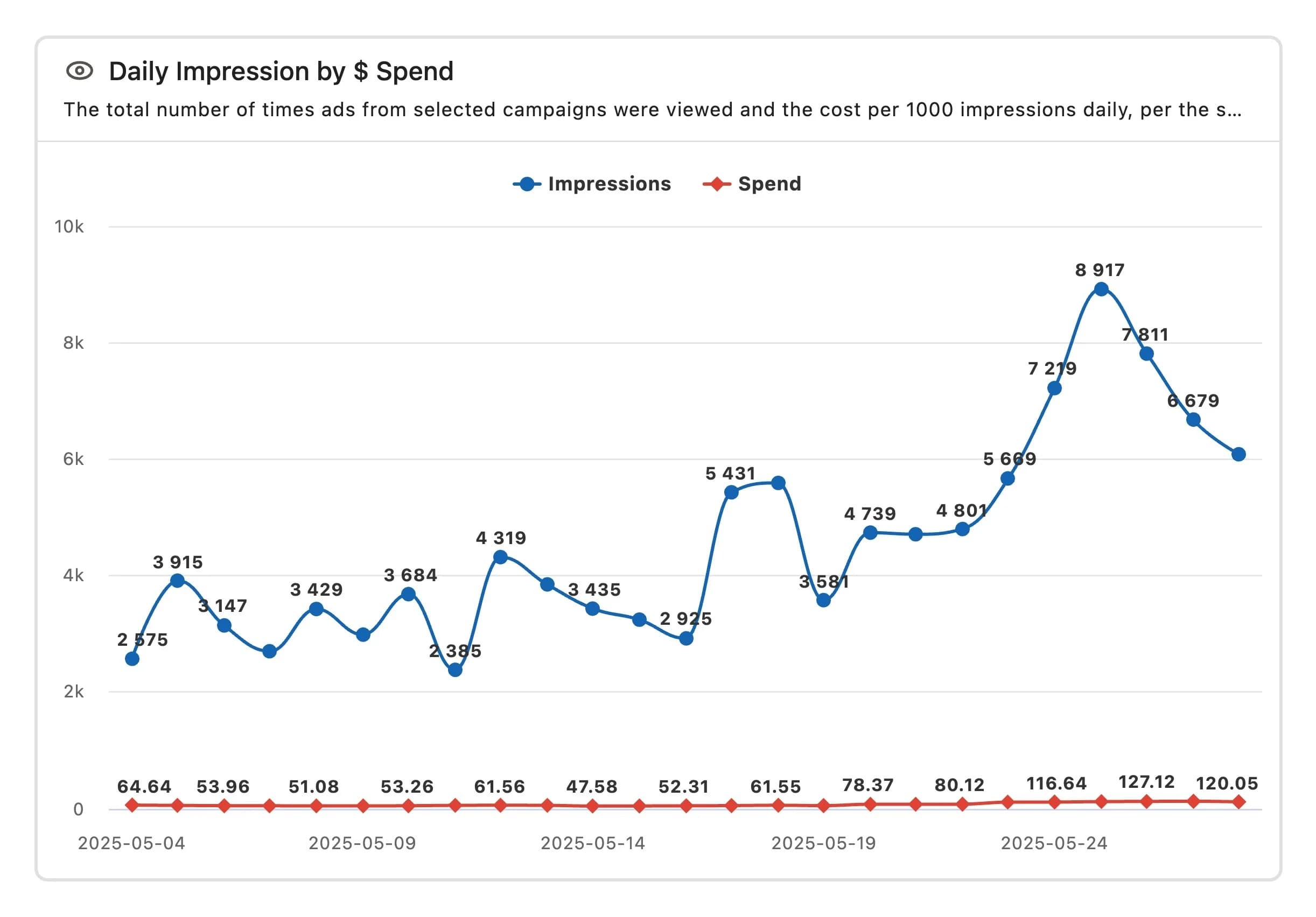
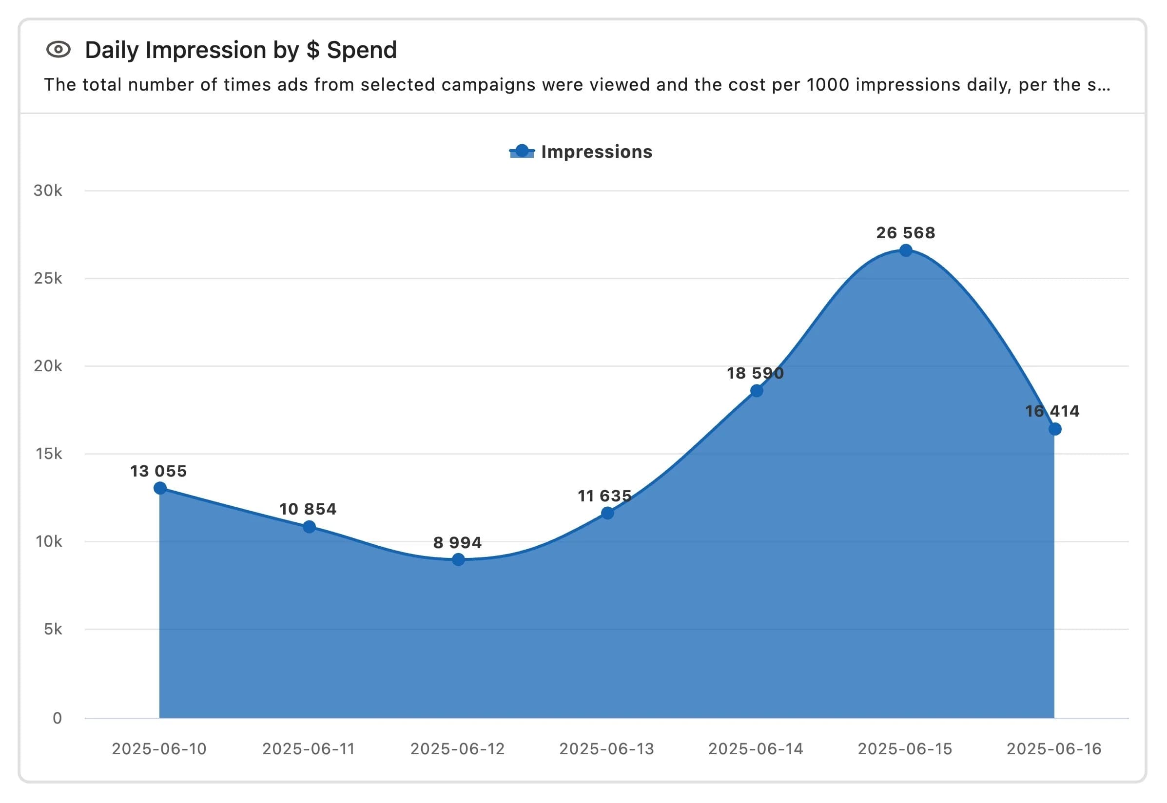
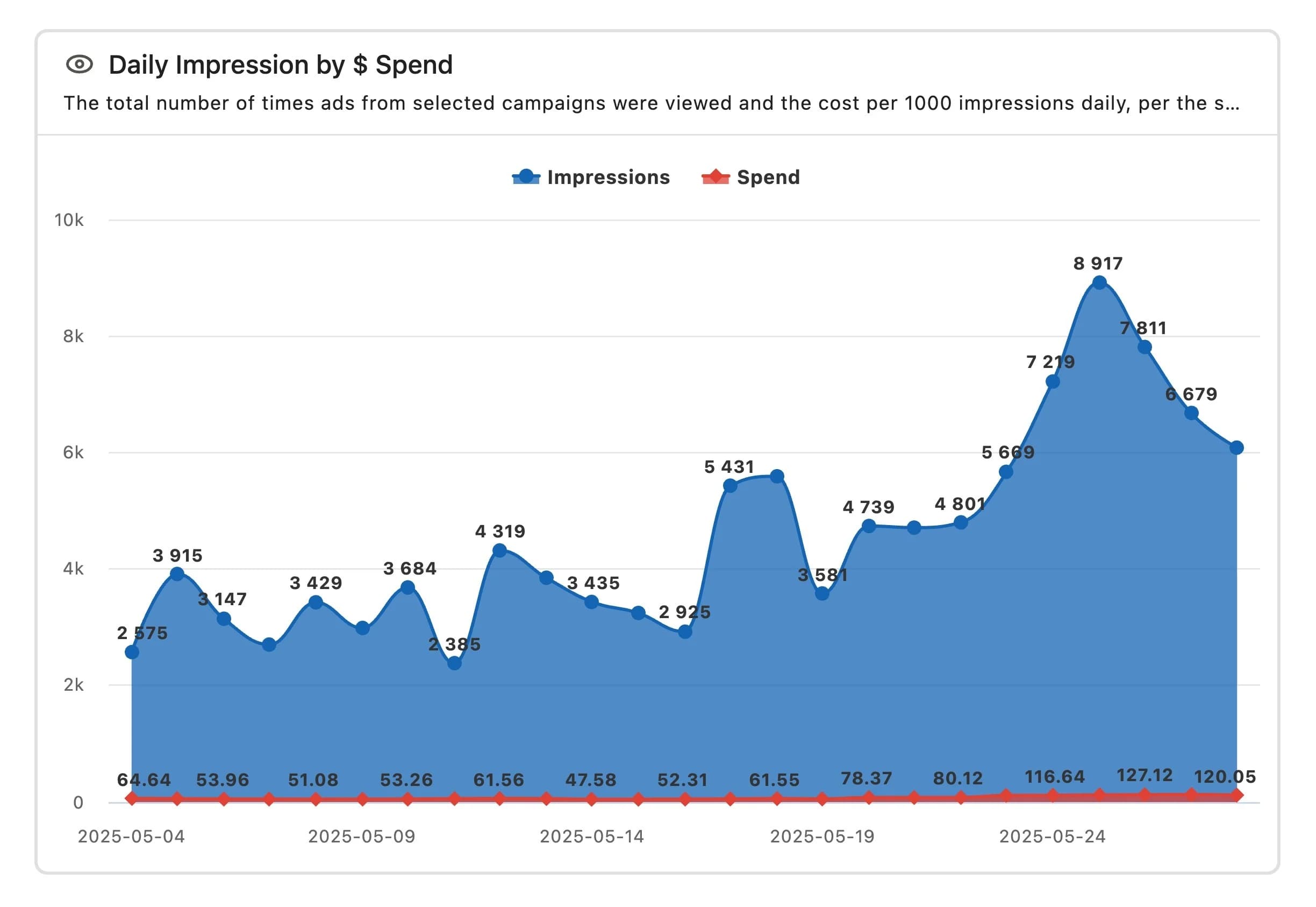
Area chart
It represents numerical values with colored areas, emphasizing the magnitude of the values. It is suitable for analyzing overall changes and trends over time. The X axis shows the dimension, and the Y axis shows the index. Hovering the cursor over a point displays the X-axis value.
Stacked area chart
Similar to an area chart, but with multiple data sets overlaid, it's better for understanding the big picture and comparative analysis. The X-axis shows dimensions, and the Y-axis shows metrics. Segments split the data into multiple layers. Hover over a point to reveal the X-axis value.
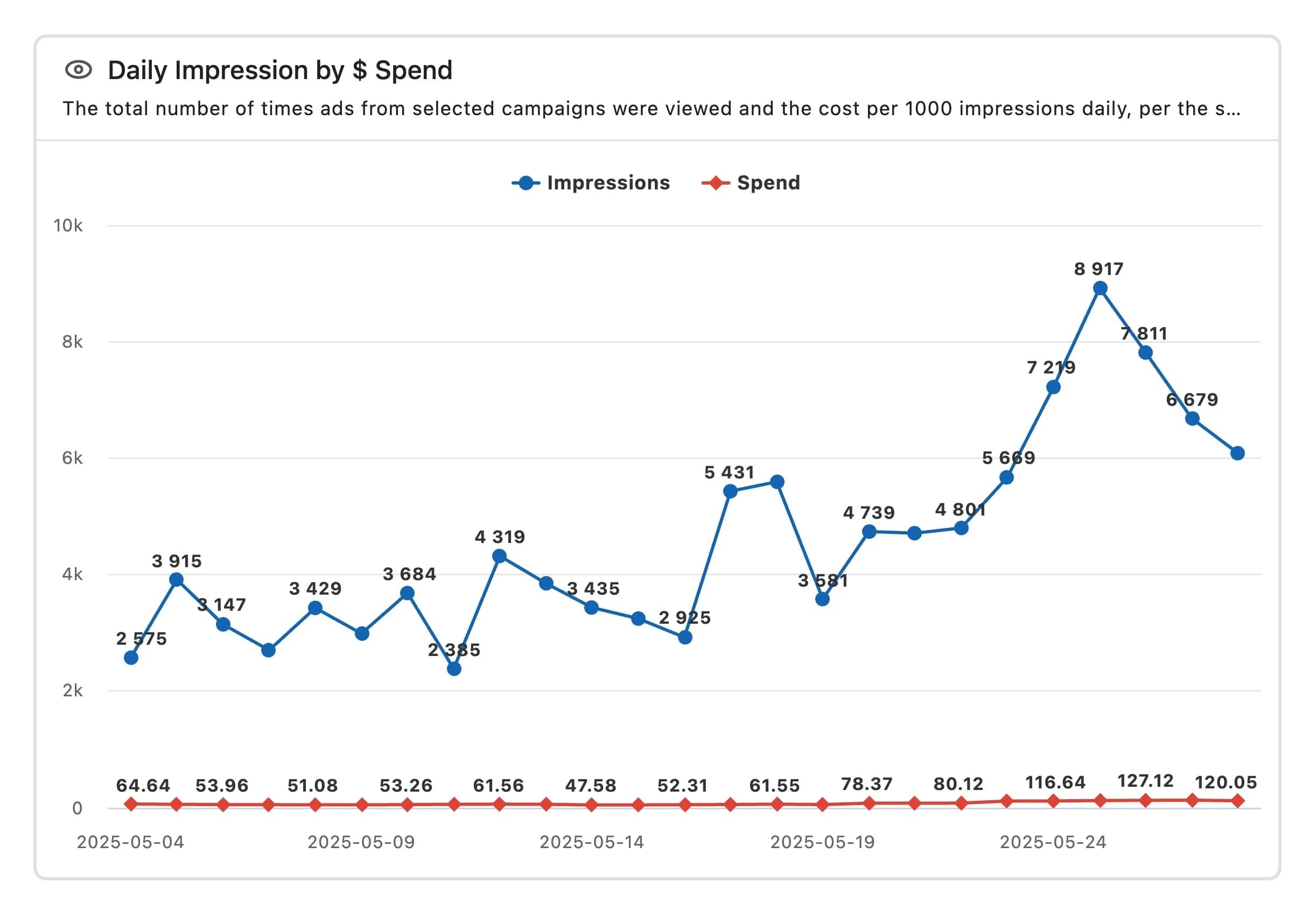
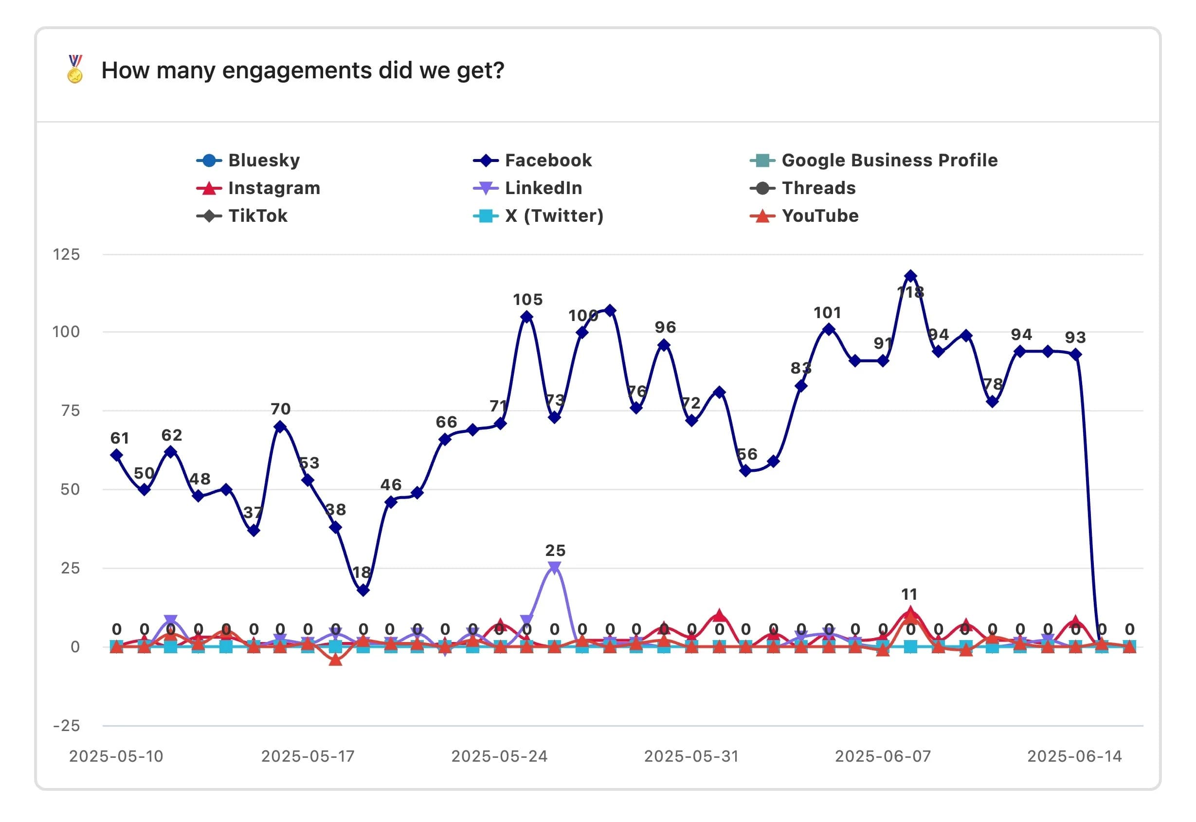
Line chart
A graph consisting of a line with data values indicated by dots. It is useful for checking data over a certain period of time. The X axis shows the dimension, and the Y axis shows the metric.
Understand the value of each segment and its impact on the whole. Hover over the points to see the exact values.

Stacked line chart
Compare different data sets by stacking multiple rows. See trends and cumulative data for each. Ideal for understanding the continuous picture. The X axis shows dimensions, and the Y axis shows metrics, with multiple lines for each segment.
Understand the value of each segment and its impact on the whole. Hover over the points to see the exact values.
Spline chart
While a line graph is a straight line, a curved chart is smoother. Like a line graph, it is useful for analyzing data over time. The X-axis shows the dimension, and the Y-axis shows the metric.
It is suitable for checking overall increases, decreases, and distributions. You can check the exact value by hovering over the point.
Stacked spline chart
This chart has the same content as a stacked line chart, but with a softer feel. It's ideal for getting a continuous, holistic view. The X-axis shows the dimension, and the Y-axis shows the metric, with multiple lines for each segment.
Understand the value of each segment and its impact on the whole. Hover over the points to see the exact values.
Area spline chart
This is a filled-in chart that curves the straight lines of an area chart. It gives a softer impression than the sharp angles of an area chart. The X axis shows the dimension, and the Y axis shows the index. Hovering the cursor over a point will display the X-axis value.
Stacked area spline chart
A curved fill type stacked area chart, with a softer look. The X-axis represents dimensions, and the Y-axis represents metrics. Segments divide data into multiple layers, allowing you to see the big picture and compare segments. Hover over a point to see the X-axis value.
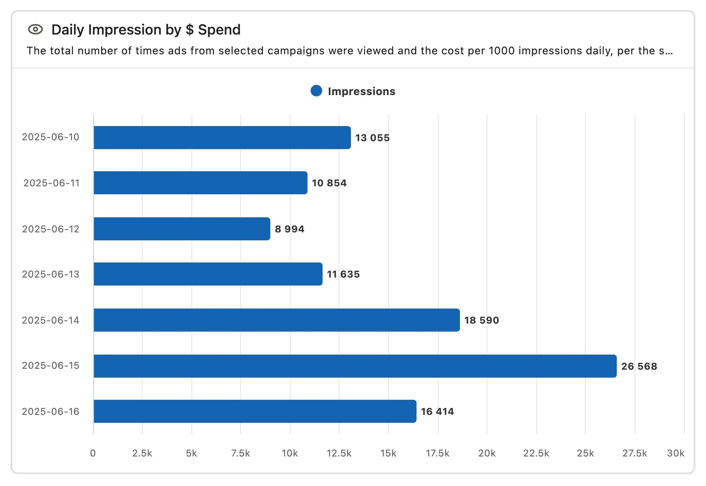
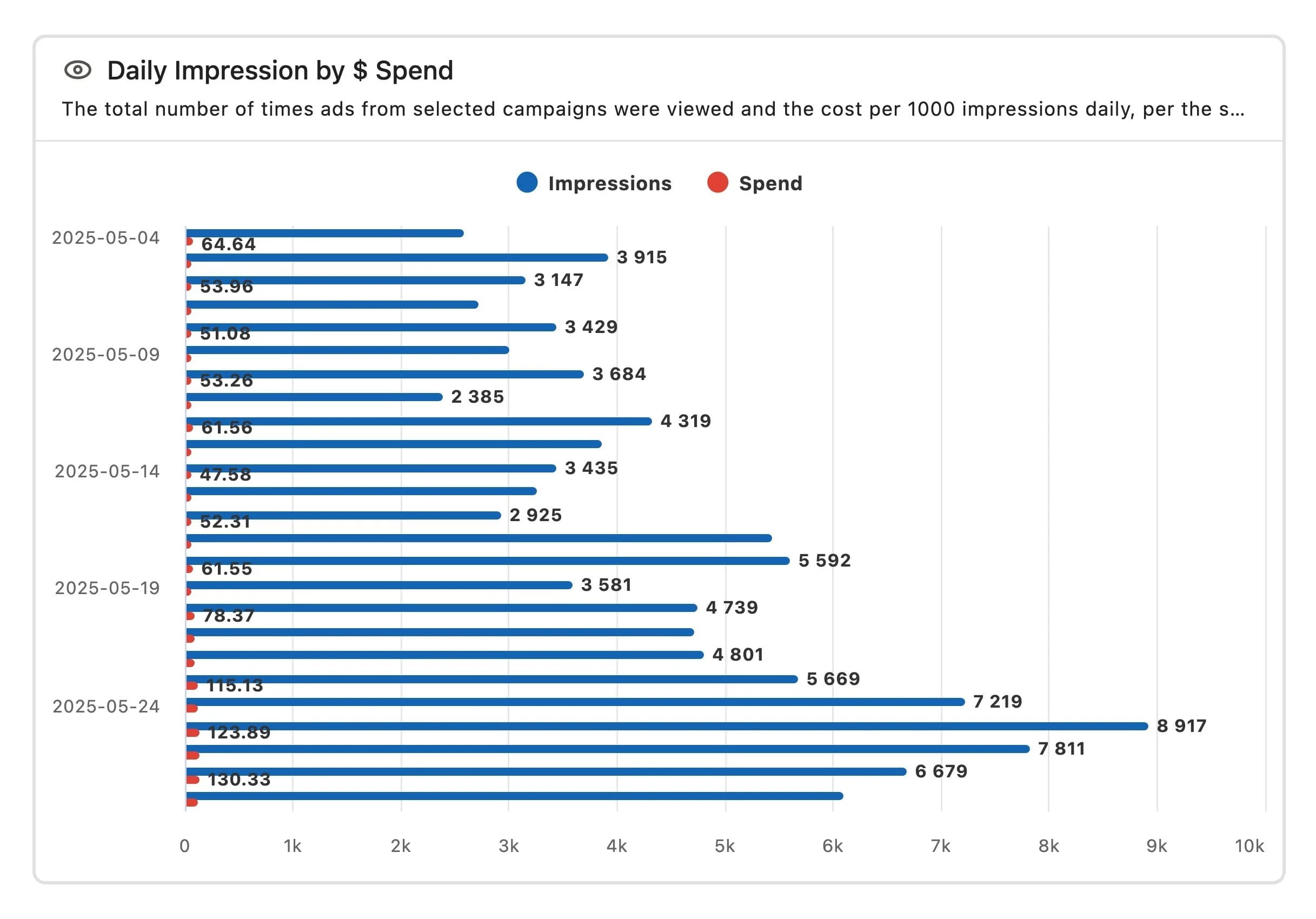
Bar chart
Numerical values are displayed as horizontal
Stacked bar chart
While a regular bar chart is displayed horizontally, a stacked chart places different categories next to each other. The X-axis represents the metric, and the Y-axis represents the dimension, with each segment displayed as a horizontal bar. You can hover over the points to see the exact value.
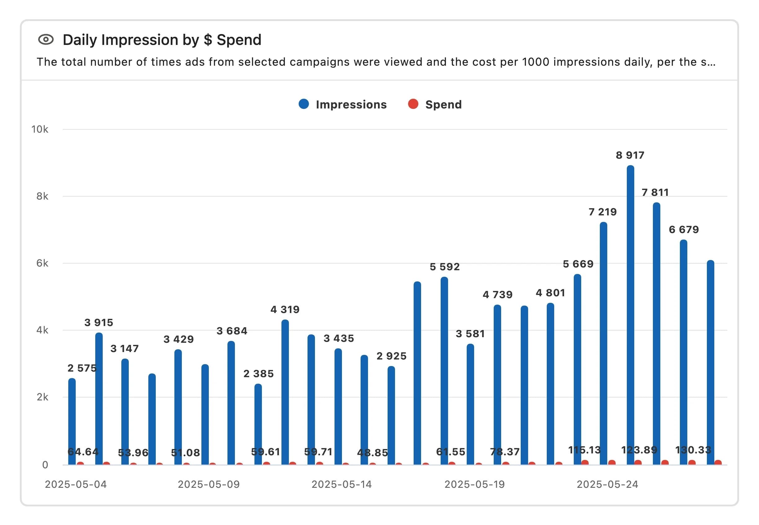
Column chart
The values are displayed as vertical bars, one for each category, arranged vertically. The X axis represents the dimension, and the Y axis represents the metric, displayed in columns for each segment.
It's great for comparing two or more discrete categories, but it excels at displaying continuous data. You can hover over the points to see the exact values.
Stacked column chart
Each category is displayed in a single vertical bar. The X axis represents the dimension, and the Y axis represents the metric, with each segment displayed in a column.
The column height reflects the value at that segment; you can hover over the point to see the exact value.

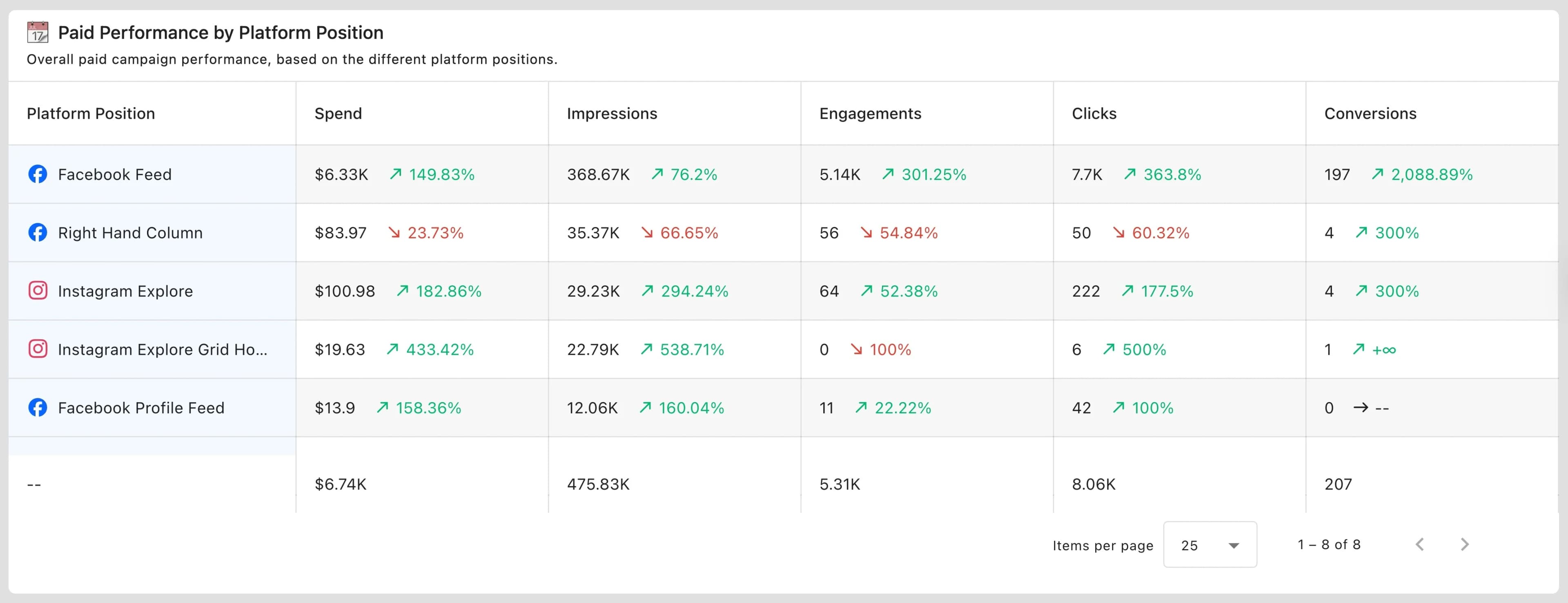
Table chart
You can easily compare multiple values or metrics side by side. Rows represent dimensions and columns represent metrics.
You can also sort in ascending or descending order. For large data sets, you can also specify the maximum number of rows to display per page (10, 20, 50, 100, 250, 500, 1000 rows; default is 100 rows).
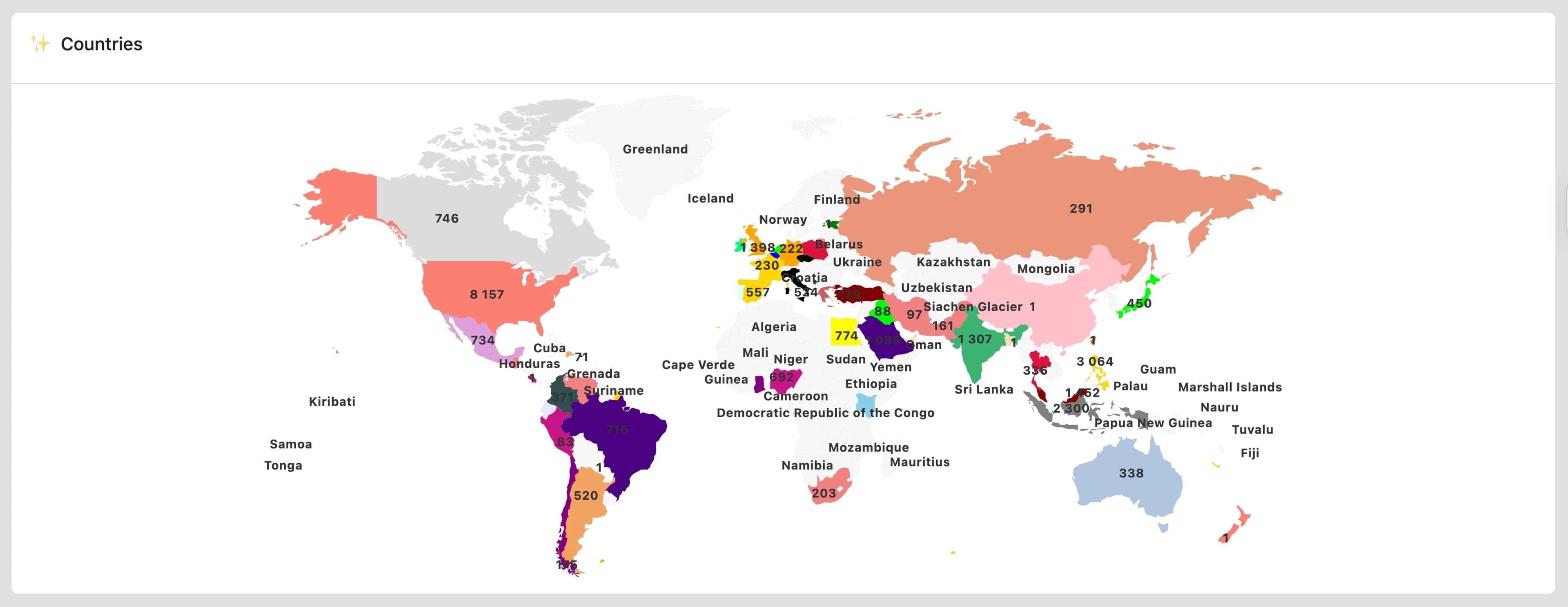
Map chart
This is useful when you want to check which countries have the most followers or reach. Instead of simply staring at numbers, analyze the data visualized on a world map. You can see at a glance which regions have the most followers, allowing you to create more effective content strategies tailored to those regions.
Darker colors represent higher values, and lighter colors represent lower values. You can hover your cursor over a location to see the values for that country.
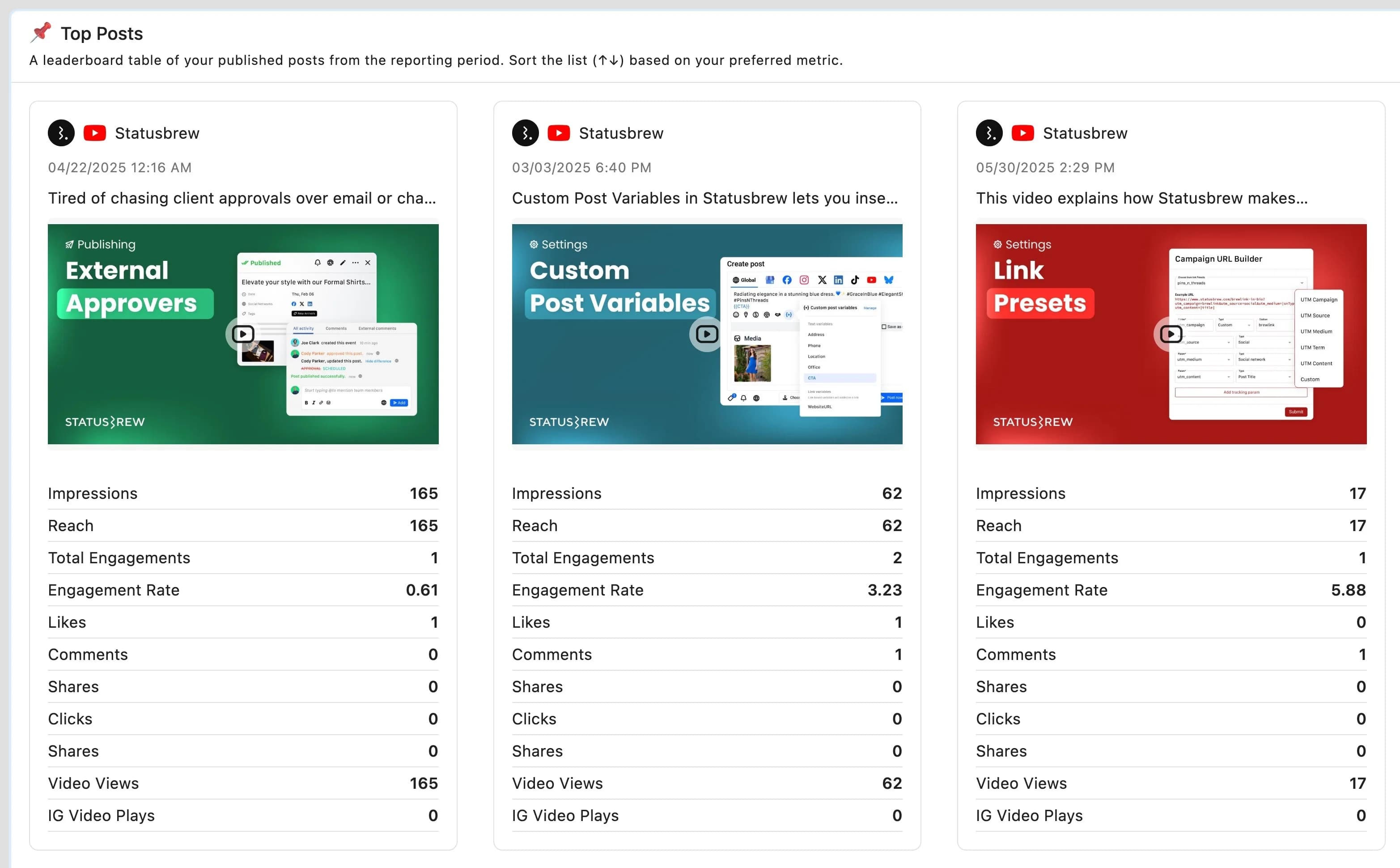
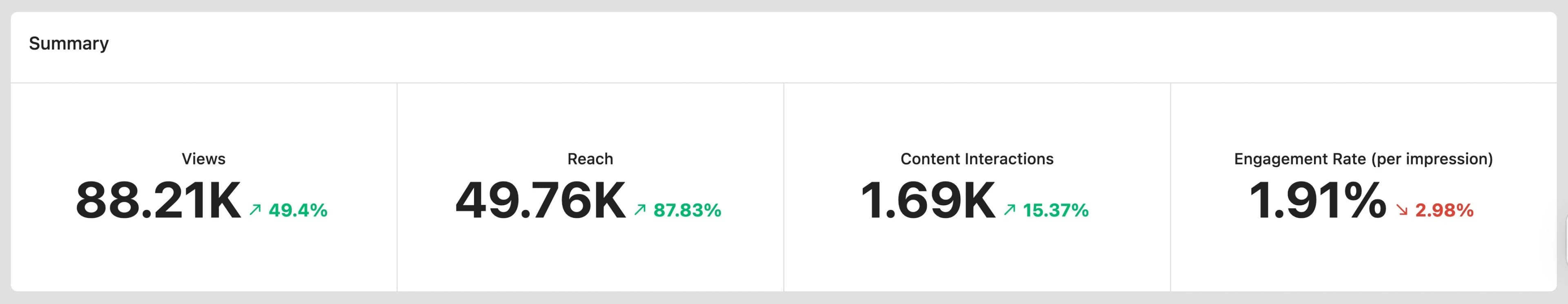
Card
Data is displayed on small rectangular cards. While pie charts are suitable for visualizing simple data with little information, cards are suitable for cases where there is multiple data to analyze. Even if multiple values are reflected, each is clearly displayed on its own line. You can easily change the position of cards by simply dragging and dropping.
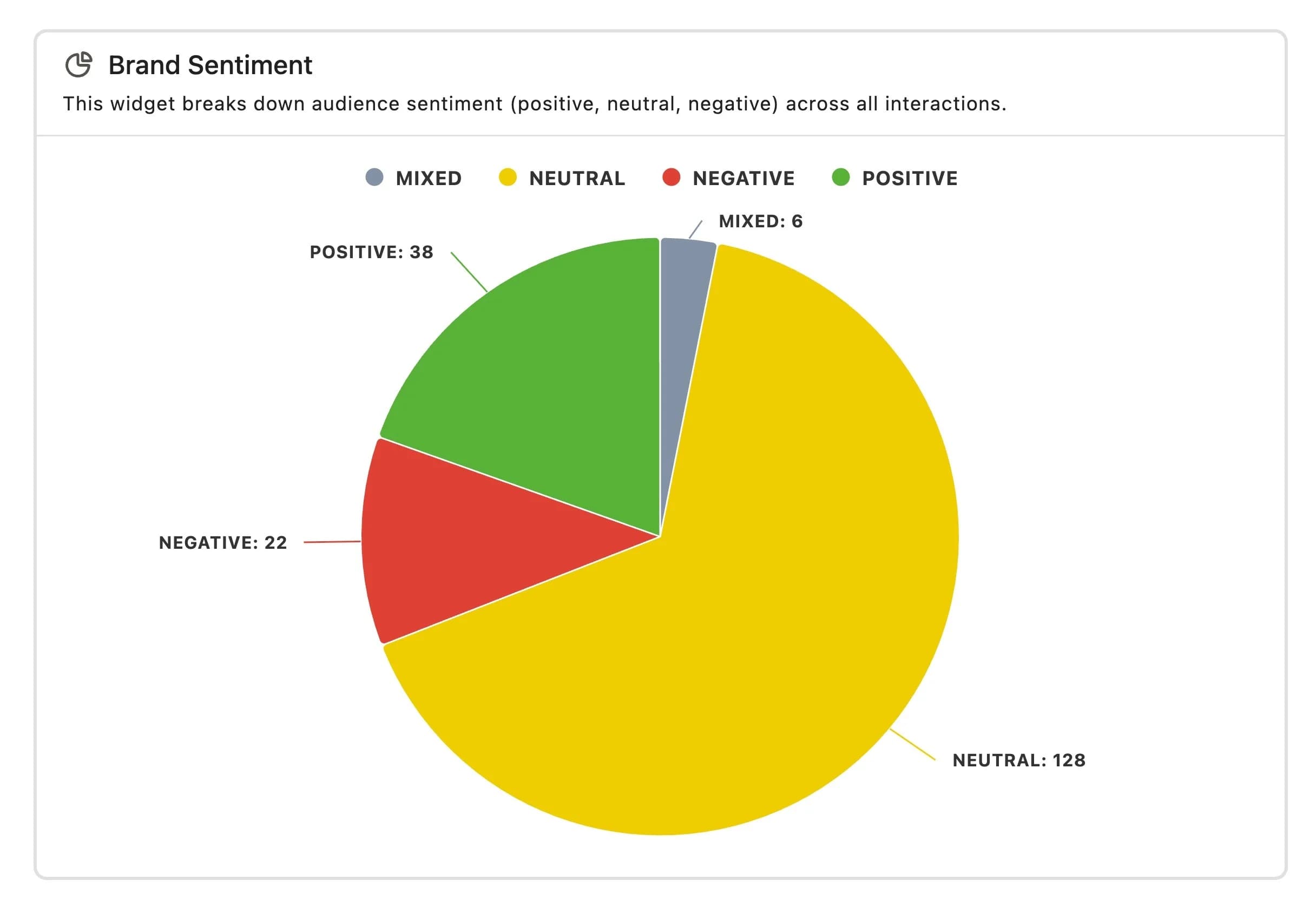
Pie chart
A pie chart is a simple visual that uses color coding for each category. You can quickly check the breakdown. While you can select multiple dimension labels for more complex analysis, it is best suited for simple analysis.
You can check the values of each part by placing the cursor over it.
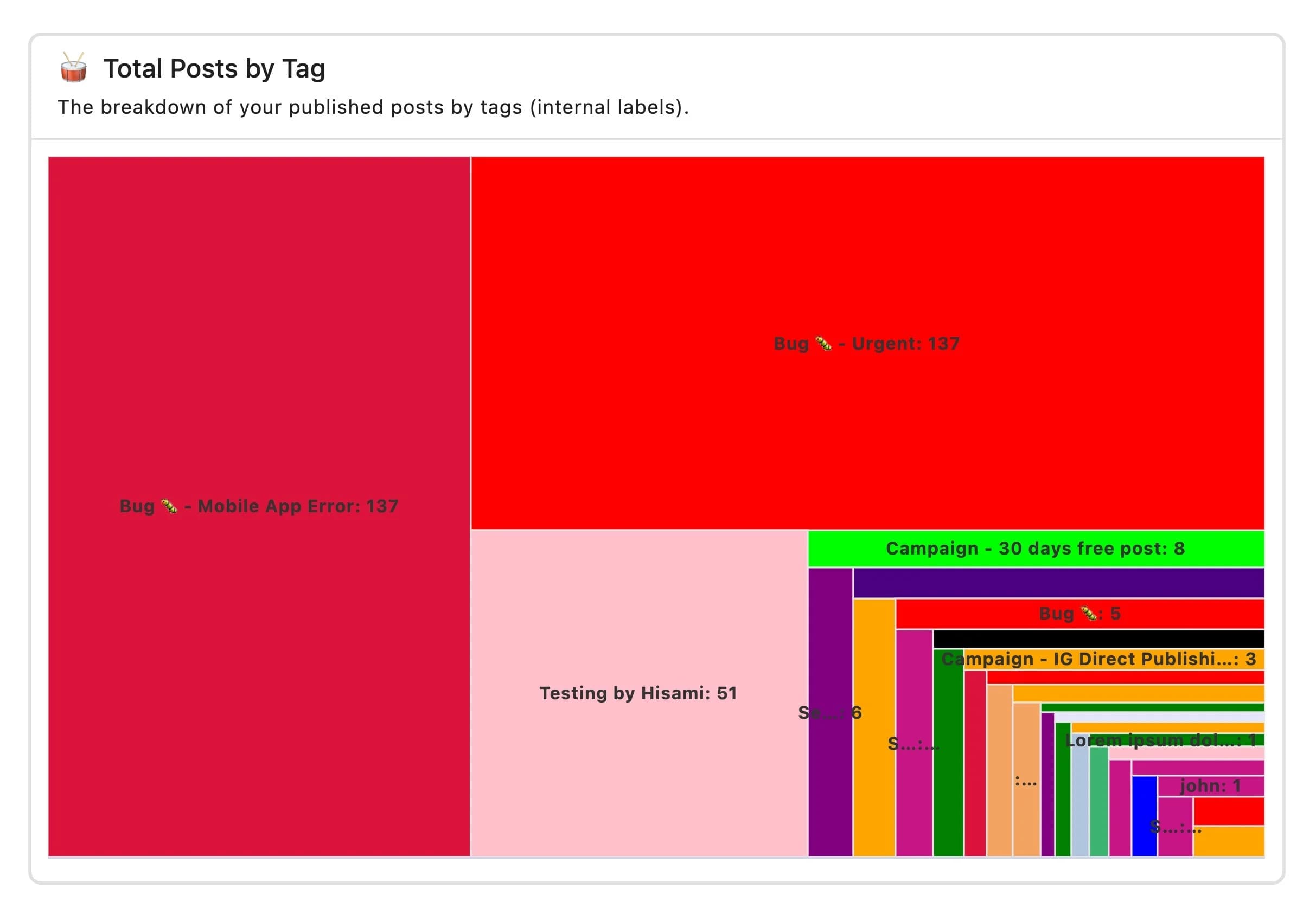
Treemap chart
The nested rectangles display data hierarchically, showing the proportions between categories or subcategories. This display is space-efficient, even when there are multiple metrics with small values.
Place the cursor over the cell to see the rounded number.
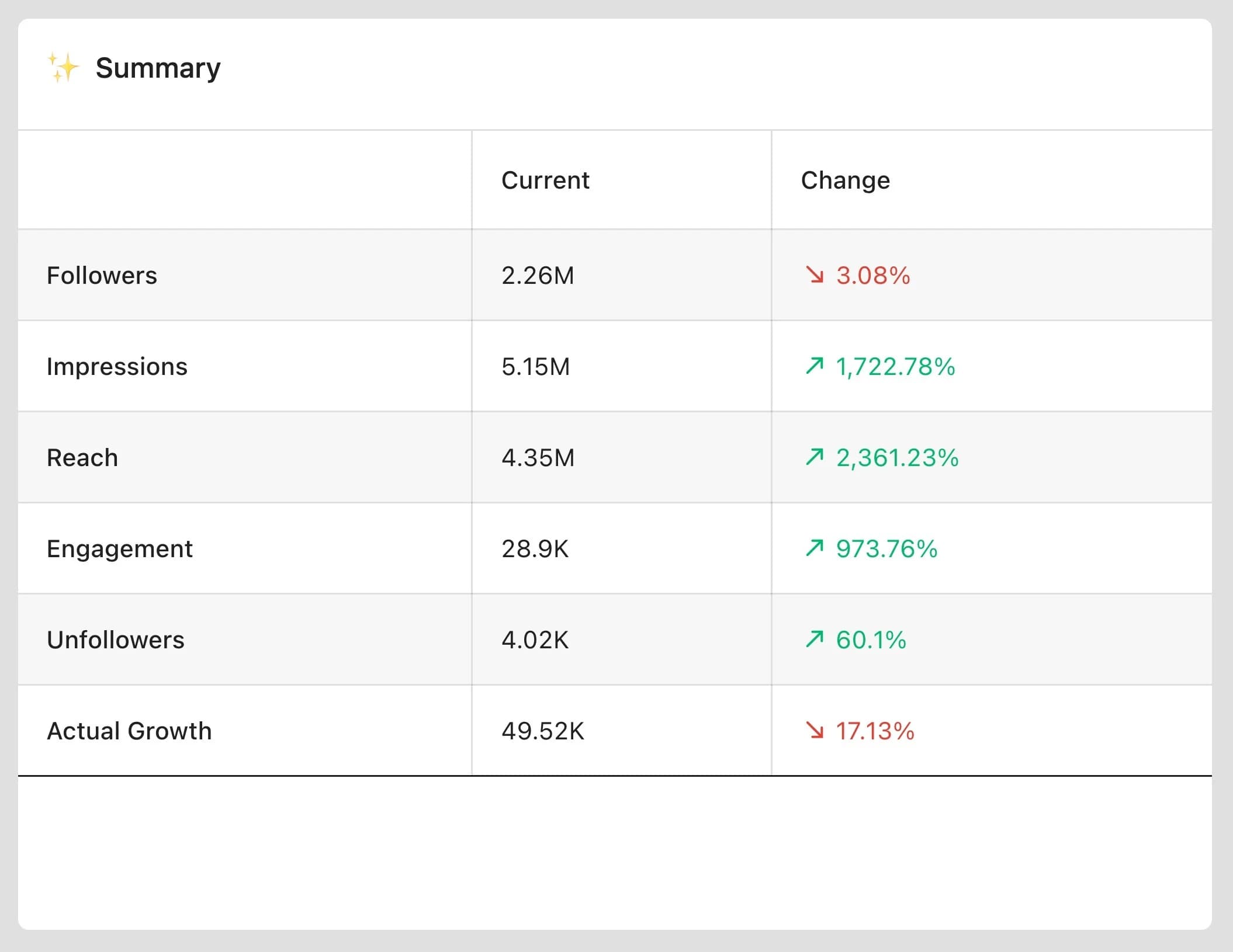
Summary table chart
A summary format of key statistics. Useful for concise data viewing and quick reference. One metric per line.
A red down arrow indicates a decrease, a green up arrow indicates an increase.
Number chart
This is a simple display format that shows the metric values as they are. It is useful when you want to emphasize KPIs such as follower count or engagement rate. You can select multiple metrics, and in some cases, a two-column grid layout will be automatically created. The metric name is displayed at the top of each cell, and the numerical value is displayed in the center.
When you select a comparison period, the percentage change will be displayed next to the number. A red down arrow indicates a decrease, and a green up arrow indicates an increase. Hover over the number to see the exact value (not rounded). Hover over the percentage change to see the exact current and historical value.
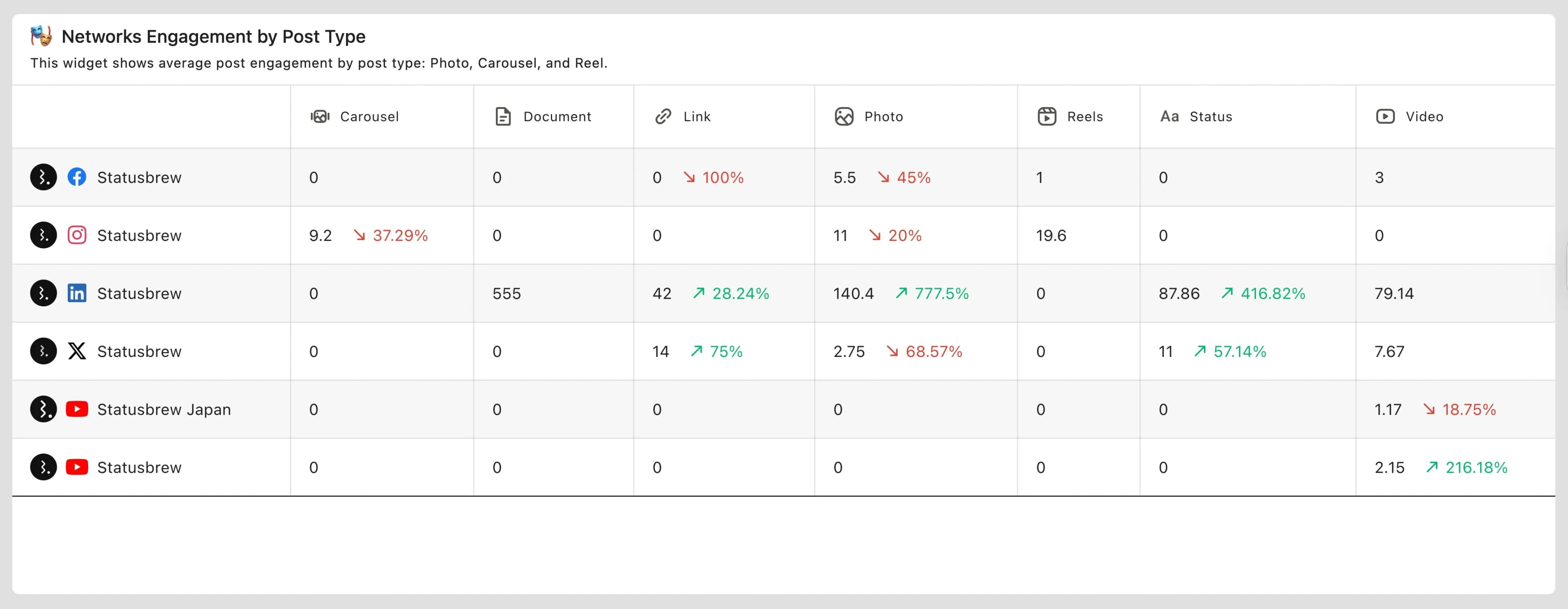
2D table chart
Display data in a two-dimensional format with rows and columns, allowing for detailed comparisons across multiple metrics and categories.
Heatmap chart
Displays data using numerical values as colors. The darker and more saturated the color, the higher the value, and the lighter the color, the lower the value. Hover your cursor over a cell to display the numerical value. You can switch the layout by dragging and dropping dimensions.
It's especially useful for identifying the best times to post, a valuable form of analysis that can help increase engagement and visibility.
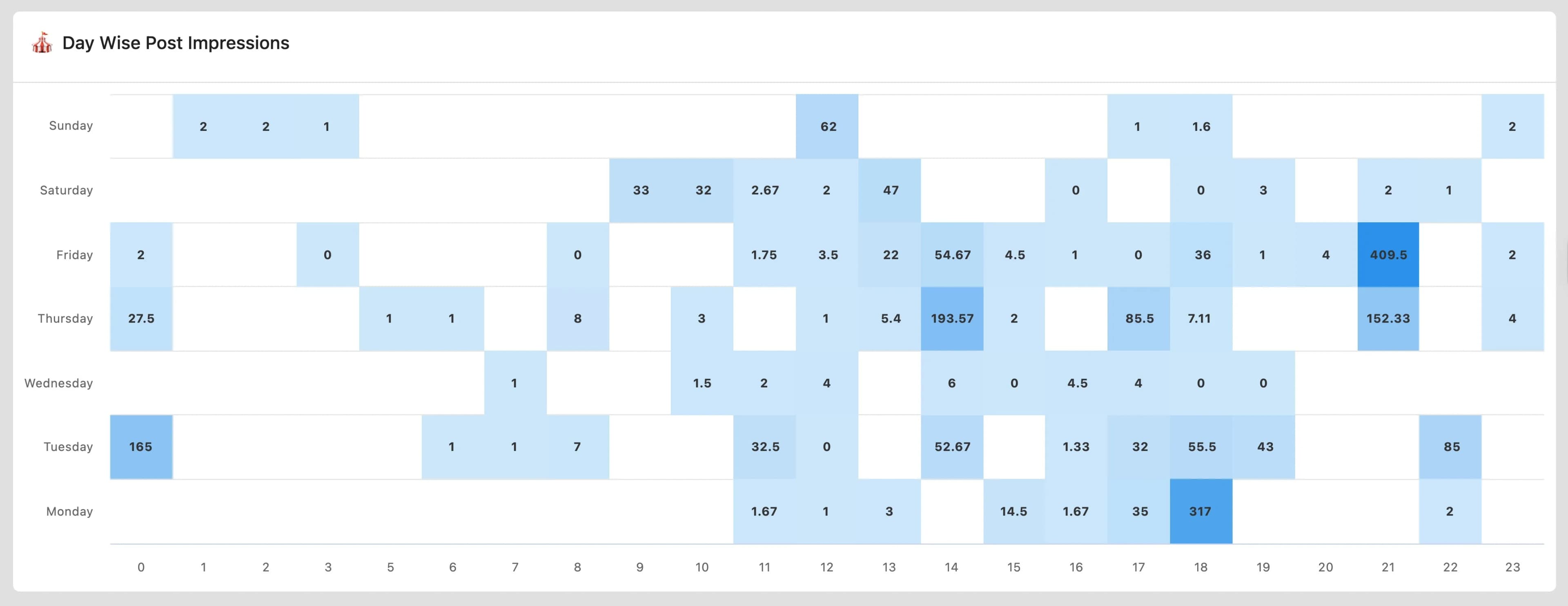
Tip: You can heatmap chart to find the best times to post. This is a great way to increase visibility and engagement.
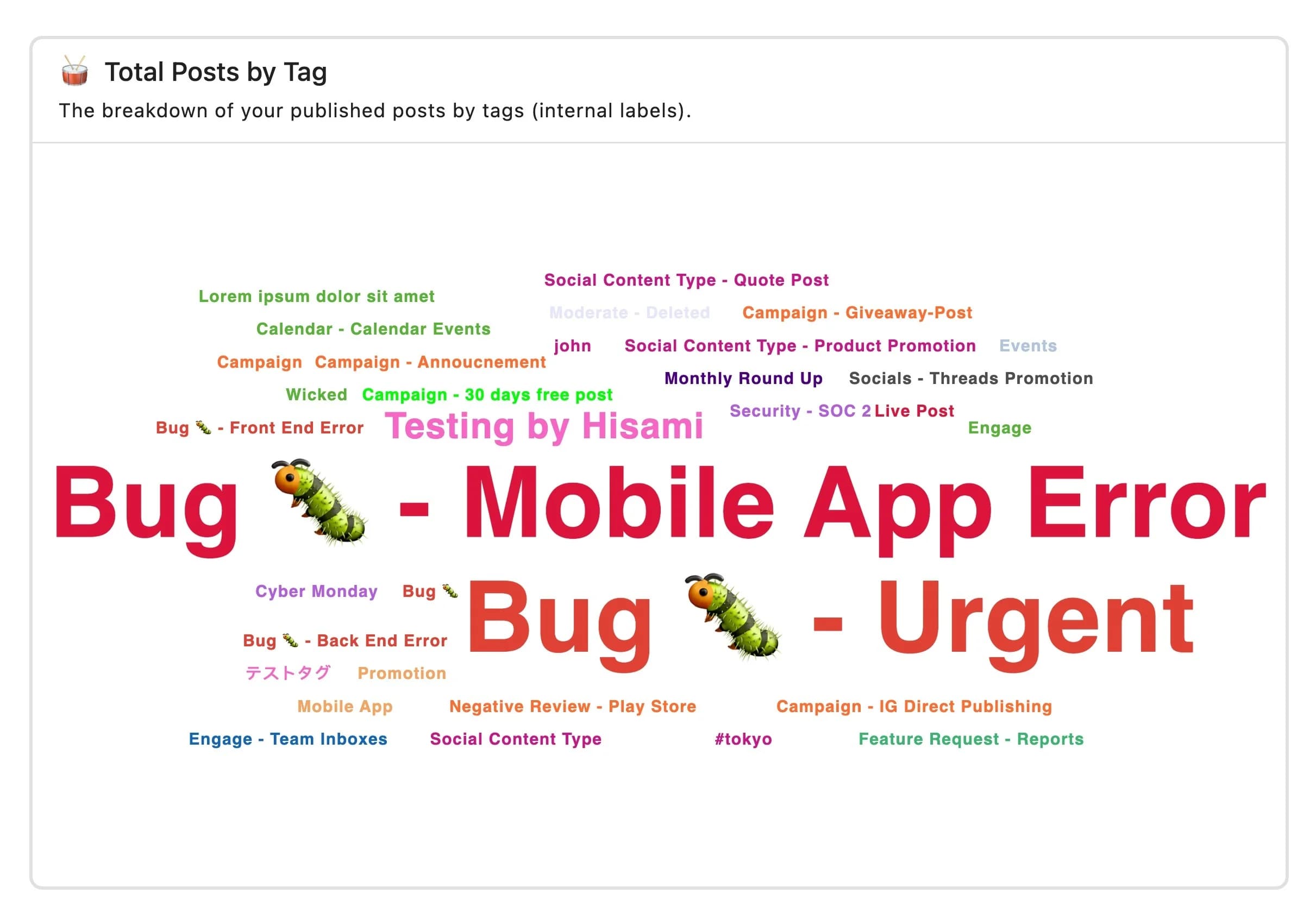
Wordcloud chart
This display reflects frequently appearing words and words that are considered important in font size. It is effective for analyzing hashtags and comments.
How To Change The Visualization Type Of A Widget?
Go to Reports
Go to the widget and select (More).
Select Widget settings
Select a visualization
Click Save when you're done.
There is an easier way to change the visualization.
If you have any unnecessary metrics or dimensions, click the trash can icon to the right of each.You can delete it by clicking .
For (stacked) Area charts, Bar/Column charts, and (stacked) Line charts (including various spline charts), you can also define widget settings such as defining the scale for the X and Y axes, setting a goal line, and starting the Y axis from zero.
For heat maps and various table charts, you can also define widget settings such as hiding previous periods or displaying them as numbers.
FAQs
Why Is My Line or Area Chart Showing a Single Number Instead of a Graph?
Line, area, and spline charts require a dimension on the X-axis to plot over time. Without one, the widget has nothing to plot across, so it displays a single aggregated number instead.
To fix this, open the widget editor and first of all select your metric (e.g., Impressions) in the Series field and then select Date as your X-axis dimension under What would you like to plot on your widget? Once both are set, the chart will draw correctly.
My Line or Area Chart Is Configured Correctly, but Still Shows a Flat Line or Single Point. What’s Wrong?
Check your report's date range. If it's set to Yesterday or another single-day range, there's only one data point to plot, so the line won't be meaningful.
Switch to a longer range, such as Last 7 days or Last 30 days, and the chart will populate with multiple points.
Can I Compare Patterns From Two Different Months on the Same Graph?
Not directly.
Statusbrew can show a metric over a selected date range, such as February to May, using a line chart with Month or Date on the X-axis.
However, Statusbrew does not currently support overlaying two separate months as two separate lines on the same chart to compare their daily patterns.
For example, you cannot show:
March data by day as one line
April data by day as another line
Both lines on the same graph for pattern comparison
This applies to metrics such as impressions, reach, engagement, clicks, replies, followers, and others.
If you need this type of month-over-month pattern comparison, export the data for both months and create the chart in Google Sheets or Excel.