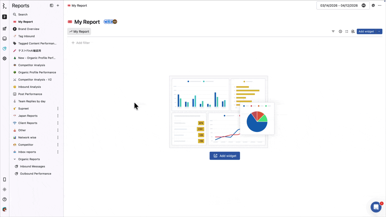
Add Widget To A Report
Add widgets to your reports to track the metrics that matter most. Choose from 250+ metrics, 22 visualizations, and arrange everything on your report canvas exactly the way you want it.
Who Can Add Widgets?
Admins, Primary Owners, Owners, and Regular Users with View Reporting permission for a profile or profile group can add and manage widgets. Custom Reports are available on Premium and above.
How To Create A Custom Widget?
There are two ways to create a custom widget: describe what you want and let AI configure it for you, or build it manually from scratch.
Using AI To Generate A Widget
Describe what you want to see in plain language. The AI reads your description and automatically selects the visualization type, metric, dimension, and filters.
Available on Premium and above.
Go to Reports.
Open the report from the sidebar.
Click Add widget, then Create a custom widget.
In the Describe what you want to see field, type a plain-language description of the widget you want.
Click Generate.
The AI auto-fills the widget name, description, visualization type, metric, dimension, and filters. A confirmation banner appears: "We've configured this widget based on your request."
Review the configuration. The live preview on the right updates in real time.
Adjust any fields if needed, then click Save.
The AI gives you a starting point, not a finished widget. Always review the metric, dimension, and filters before saving. If the result is not right, refine your description and click Generate again.
The more specific your description, the better the result. Include the metric you care about, the breakdown you want, and the network if relevant.
Example descriptions
Post performance
Show post impressions, post reach, and post engagements for Facebook and Instagram, broken down by post type
Top 10 posts by post engagement rate on Instagram, broken down by post
Show posts published broken down by author and network
Audience growth
Compare actual growth across all networks over time
Show followers gained and unfollowers for Facebook and Instagram
Customer service
Show total conversations closed, broken down by agent
Compare average conversation response time and resolution time, broken down by agent
Show total conversations received, broken down by sentiment over time
For paid reporting
Show ad spend, ad impressions, and CPM broken down by ad campaign
Compare CTR and link click rate for Facebook and Instagram ads, broken down by ad campaign
Building A Widget Manually
Skip the Describe field and configure everything from scratch.
Go to Reports.
Open the report from the sidebar.
Click Add widget, then Create a custom widget.
Give your widget a Widget name. You can also change the icon.
Add a Widget description to note the widget's purpose.
Select a visualization.
Select your Metric(s) and Dimension(s).
Add Filters as needed.
Define Sorting. Select a metric or dimension, then choose Ascending or Descending order. Only metrics and dimensions already used in the widget can be selected for sorting.
Select your Widget configuration options. Available options depend on the visualization selected.
Click Save.
Widget Configuration Options
The available options depend on the selected visualization.
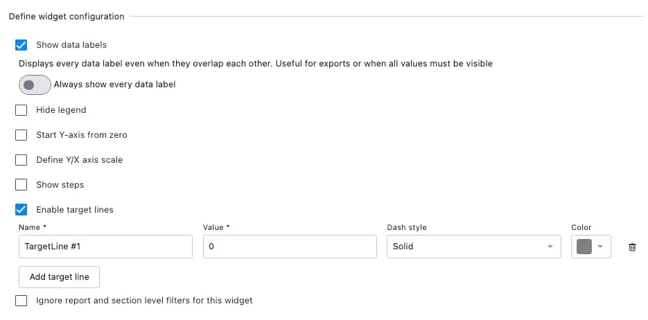
Show data labels: Labels the chart with individual data values
Hide legend: Removes the legend from the chart
Start Y-axis from zero: Ensures the Y-axis begins at zero
Define Y/X axis scale: Set minimum, maximum, and step size for axis bounds
Show steps: Displays data as stepped lines
Enable target lines: Add reference lines to measure against a benchmark. Define name, value, dash style, and color.
Hide previous period: Excludes previous period comparison from the widget
Show previous period as number: Shows the previous period value as a number instead of a percentage
Show full number: Shows complete numbers instead of shortened values (e.g., 2,262,322 instead of 2.26M)
Ignore report and section level filters for this widget: Widget uses only its own filters
As you configure the widget, the live preview on the right updates in real time. You can also change the visualization type directly from the preview panel.
If you see a "This dimension is not compatible" error, the metric and dimension you selected are not compatible with each other. Try a different dimension or check our List of Report Metrics for compatible dimensions per metric.
How To Customize Widgets In Your Report?
Once a widget is on your report canvas, you can resize, reposition, and further customize it.
To resize: Hover over the widget. Click and hold the > icon in the bottom-right corner and drag to resize.
To reposition: Hover over the widget. Click and hold the icon in the top-right corner and drag to a new position.
Click on any widget to access these options:
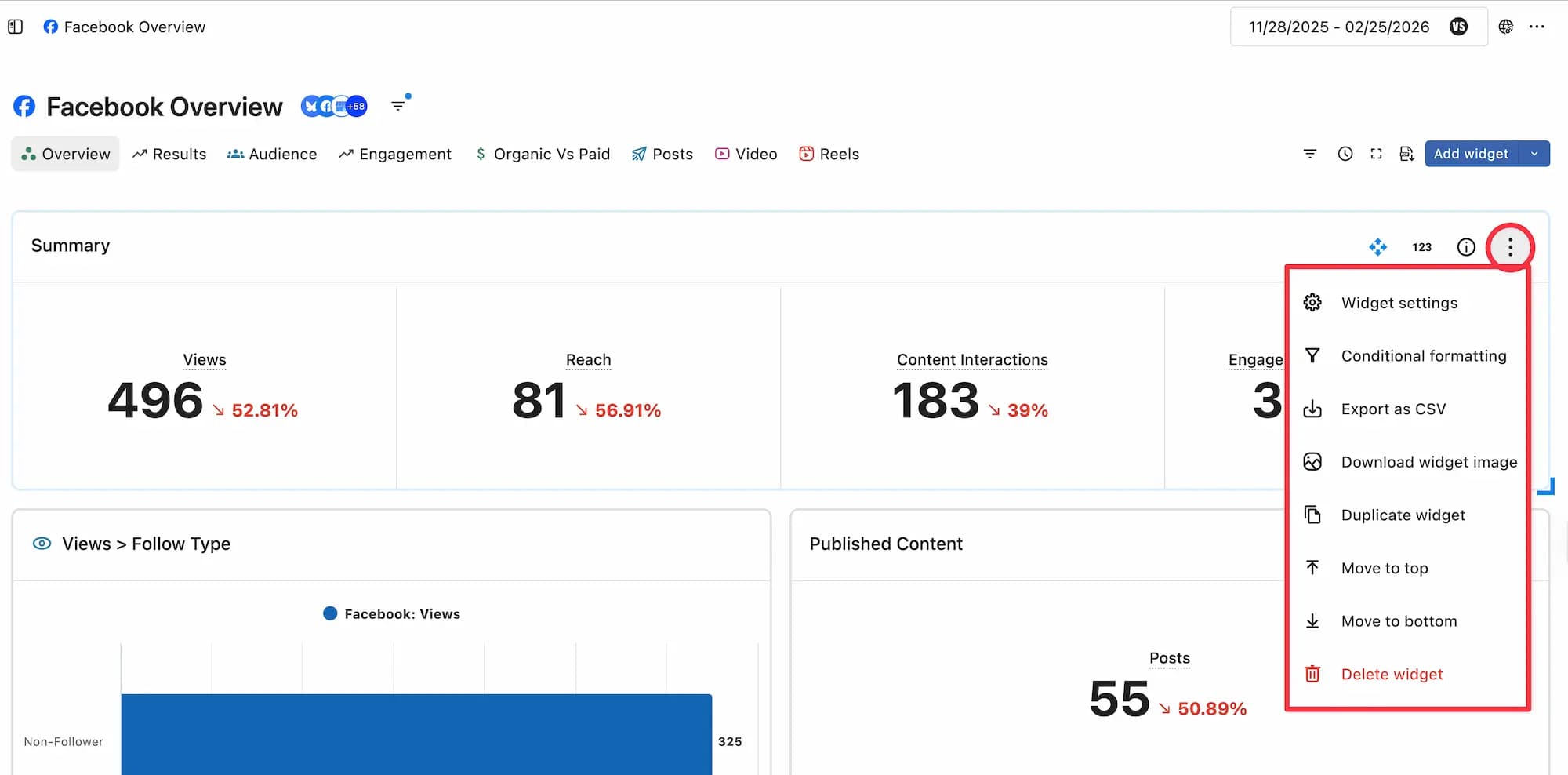
Widget settings: Edit metric, dimension, visualization, and filters without rebuilding from scratch.
Conditional formatting: Color-code metric values to highlight performance trends. You can add multiple conditions per widget.
Export as CSV: Download widget data for offline analysis or sharing.
Download widget image: Download the widget as a PNG for presentations or reports.
Duplicate widget: Copy the widget to tweak without affecting the original.
Move to top: Move the widget to the top of the report canvas.
Move to bottom: Move the widget to the bottom of the report canvas.
Delete widget: Remove the widget from the report.
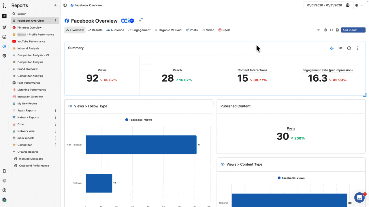
To see what a widget is measuring, hover over "i" icon in the top-right corner. The tooltip shows the metric name and definition.
Widget Library
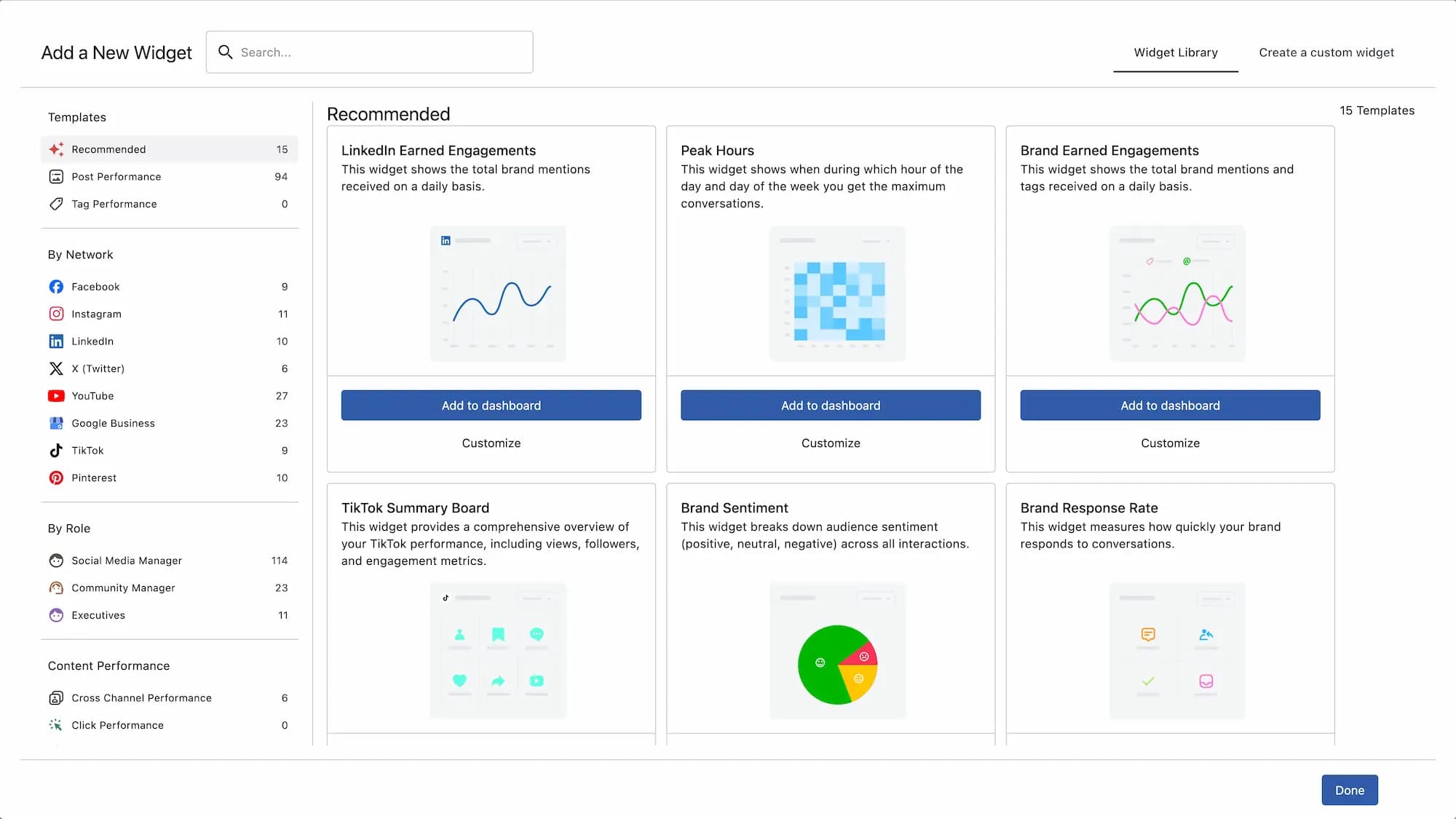
The Widget Library offers pre-built widgets covering common social media metrics. It is a quick way to add a widget without having to configure it from scratch.
Go to Reports.
Open the report from the sidebar.
Click Add widget. The Add a New Widget window opens on the Widget Library tab.
Browse by category from the left menu or use the search bar.
Click Add to dashboard to add it directly, then click Done to return to your report canvas.
Or click Customize to adjust before saving. Make your changes and click Save.
FAQs
Should I use AI or build the widget manually?
We recommend using AI. It is faster, and you do not need to know the exact metric names. Just describe what you want to see, and the AI picks the right metrics, dimensions, and visualization for you. Switch to manual only if you need precise control over a specific configuration.
Can I edit a widget after saving it?
Yes. Click on the widget and select Widget settings. You can change the metric, dimension, filters, and visualization from there.
What is the difference between Widget Library and a custom widget?
Widget Library widgets are pre-built templates with pre-selected metrics and visualizations. Custom widgets give you full control over every field. Both can be edited after you add them to your report.
Why is my widget showing no data?
Check three things: the date range set on your report, the data sources selected, and any filters applied to the widget. If the reporting period does not overlap with your data, the widget will be empty.
Can I change the visualization type after saving?
Yes. Go to Widget settings via and change the visualization from there.
Why is my widget showing 0 or unexpectedly low numbers?
First, make sure your admin or owner has granted "Create Report" access for the profiles you select, and that you use the correct data source and date range.
Now, check that your widget is configured correctly:
Metric: confirm you've selected the right metric for what you're trying to measure
Sort: confirm the sort order is set as intended
Filters: confirm each filter type appears only once, with all desired values selected within that single row
For filters specifically, each separate filter row is treated as an AND condition, meaning the widget looks for data that satisfies all rows simultaneously — which is often impossible, so the count drops to zero or a very low number.
The fix: use a single filter row for each filter type and select all the values you want within that one row. Most filters support multi-select. For example, if you want to track Facebook Comments, Facebook Messages, and Facebook Post Mentions, select all three within one Message Type filter row instead of adding a separate row for each. Values within a single row are treated as OR conditions, and your count will reflect correctly.
Can I move or copy widgets from one report to another?
No. You cannot move, copy, or paste a widget from one report or space to another.
You also cannot copy or paste a widget into a different section of the same report.
You can only duplicate a widget within the same report section and then make changes to the duplicated widget.
If a widget is already available in the Widget Library, you can add it from there. However, custom widgets cannot be saved as new widget templates or reused from the Widget Library later.
If you need the same custom widget in another report or section, you’ll need to recreate it manually. How can I create a widget that shows paid vs organic post-wise performance?
There is no post-level paid metric available in Statusbrew.
The only post-level organic metric compatible with the Post dimension is Post Views (Organic).
So, if you want post-wise paid vs organic data, the only supported setup is:
Chart type: Table
Values / Metrics: Post Views & Post Views (Organic)
Dimension: Post
Save
Post Views shows total post views.
Post Views (Organic) shows organic post views.
To get paid views, export the widget as CSV and calculate the difference manually:
Paid Views = Post Views - Post Views (Organic)
This is the only workaround for post-wise paid vs organic because Statusbrew does not have a direct post-level paid metric.
For other post metrics, such as Post Impressions, Post Engagement, Post Comments, Post Shares, Post Clicks, or Post Saved, separate paid or organic versions are not available at the post level.
For ads created directly from Ads Manager, use paid/ad reporting metrics instead. These can be reported by Ad Name, Ad Campaign Name, or Ad Set Name, but they will not show the actual ad creative as a post caption/image using the Post dimension.