We tend to put tons of effort into the content we post on Facebook, but for many businesses, cover photos for Facebook are an afterthought. In an age where creativity is highly valued, an uninspired Facebook cover photo is a surefire way to get users to stop paying attention to your brand.
To help your brand navigate the ever-changing world of Facebook cover photos & videos, we have put together this guide. So without further ado, let's start to know about the cover photo for Facebook and cover videos!
- What Is A Cover Photo On Facebook?
- What Is The Facebook Cover Photo Size?
- File Type For Facebook Cover Photos
- Facebook Cover Photo Best Practices
- Facebook Cover Photo Ideas
- Common Facebook Cover Photo Mistakes
- Putting It All Together
You can directly jump to a section of your choice or keep scrolling.
Important Read: How To Go Live On Facebook Like A Pro
What Is A Cover Photo On Facebook?
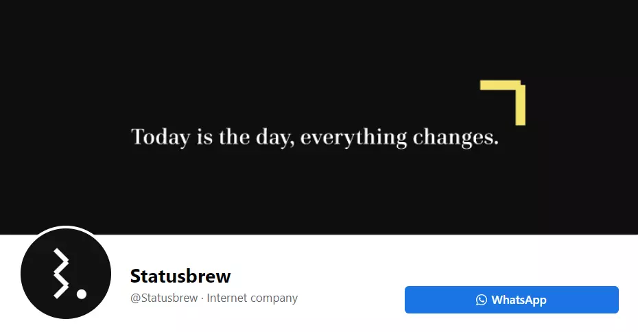
The simplest answer to this question is to define a Facebook cover photo as the first contact point with your audience. In fact, cover photos for Facebook are the very first thing that a user sees on your Facebook business page. Cover photos for Facebook are the large banners introducing your business page to users. As the first impressions are the most lasting ones, your business has to get the most from Facebook cover photos.
What Is The Facebook Cover Photo Size?
The maximum Facebook cover photo size is 820 pixels X 312 pixels on your Page on computers & 640 pixels X 360 pixels on smartphones. The minimum required Facebook cover image size is 400 pixels X 150 pixels.
With that being said, it's recommended that you use the dimensions 820 pixels X 360 pixels to ensure the text and graphics you have used in your Facebook cover photos are kept in the middle "safe area."
The Facebook group cover image size is 1,640 pixels X 856 pixels (or 1.91:1 ratio).
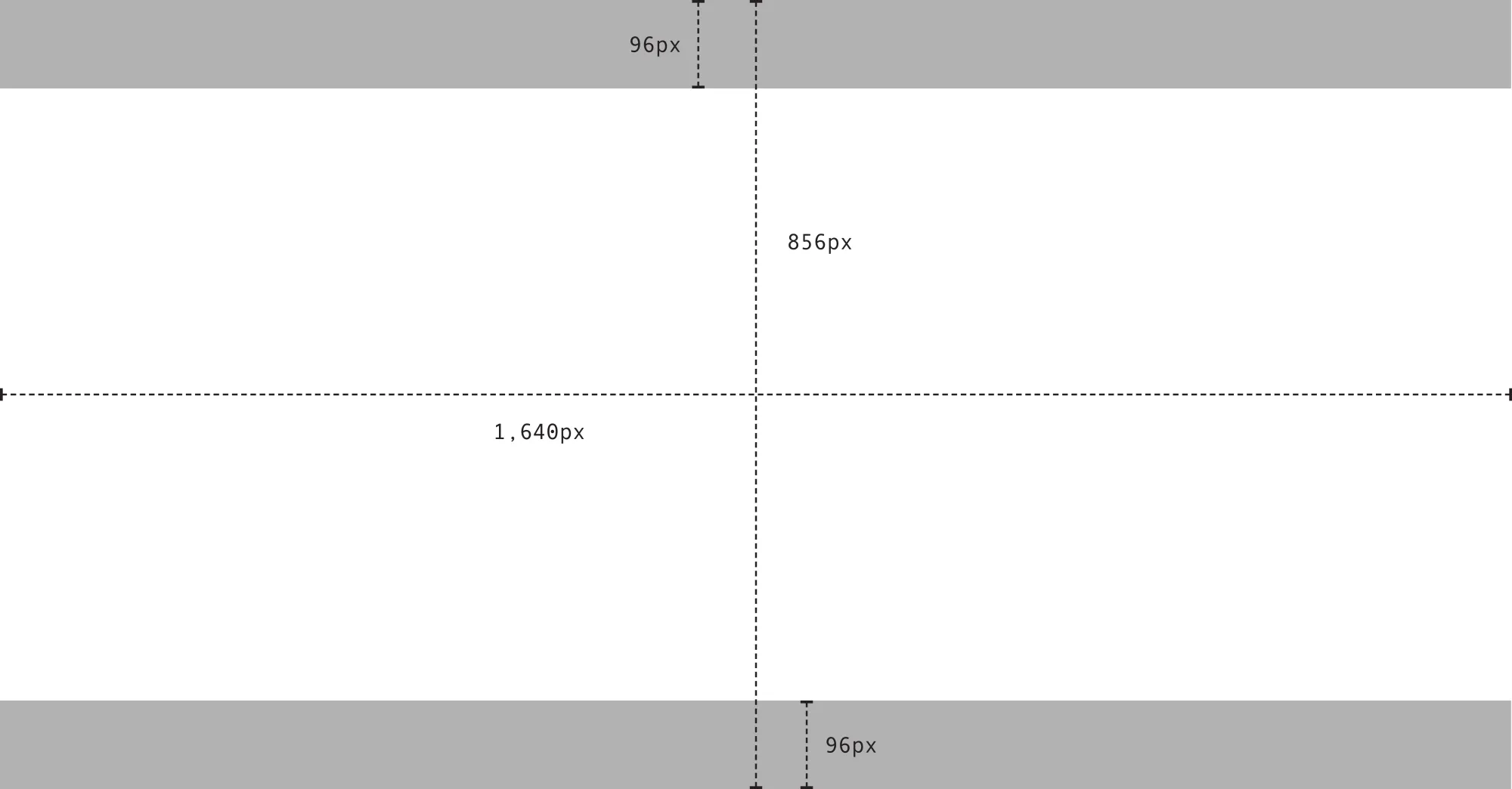
Facebook group cover photo size
File Type For Facebook Cover Photos
The best file type for Facebook cover photos is both a JPG file and a PNG file.
It is recommended to use a JPG file if your cover photo for Facebook is simply a picture and a PNG if your Facebook cover photo is a logo or text. JPG files load fastest as an sRGB JPGs file that is of size 851 pixels X 315 pixels and less than 100 kilobytes. If your Facebook cover photos contain logos or text in them, you may get better results with a PNG.
Facebook Cover Photo Best Practices
Although it seems like a simple concept, there are some best practices you should keep in mind so that you can make a stellar Facebook cover photo every time.
1. Follow Facebook's Branded Profile Guidelines
Facebook has put together explicit guidelines for what can and cannot go on a branded page (a business page is also considered a branded page).
These are mostly common guidelines of the platform, but you would be surprised to know how many people overlook this information. Neglecting to follow Facebook guidelines can result in having your Page temporarily suspended.
Here are the most important takeaways:
- Do not attempt to impersonate another entity, brand, or public figure
- Don't advertise scams or deceptive business practices
- Your Facebook cover photo should not include a verified checkmark, third-party products, sponsors, or brands
Your Facebook cover photos are public, so anything you put here will be seen by anyone who clicks on it. This goes for personal & business pages, events, and Facebook groups.
Keep your Facebook cover photos as professional-looking as possible as it's a reflection of your business & the first thing users see when they click on your Page.
2. Show Your Brand's Personality
There's impressive power in images. What seems like a simple image can quickly tell people much more about your brand or business than you might think. People learn visually, & there is a lot that your Facebook cover photo can communicate to your viewers.
Use your cover photo on Facebook as an opportunity to show off your brand's personality. Is your brand entirely known for its simplicity, humor, or something else?
When users ,who are familiar with your brand, click on your Page and find an image with the personality they know, it tells them they are at the right spot. You are also showing brand consistency, which helps build trust.
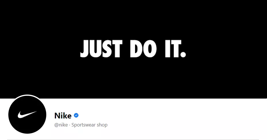
For instance, Nike gets their iconic slogan front and center in their cover photo on Facebook. There's nothing confusing, flashy, or overly promotional. And its immediate brand recognition.
3. Keep It Simple
Facebook cover photos are extremely valuable real estate, but that doesn't mean you should weigh them down with complicated images or too much text.
You can still make good use of that space with a simple image and if needed, you can generate AI images to create the perfect Facebook cover photo that fits cleanly and still grabs attention.
4. Highlight News & Updates
The value in the simplicity of your Facebook cover photo is exceptional, but do not hesitate to use that space to show your brand highlights or news. Your cover photo on Facebook should entice users to scroll further down your Page so that some well-placed promotional content can draw them in even more.
Here's an excellent example of using a Facebook cover photo to show business updates from Netflix. They have used the space to highlight a new show. The image only shows the most critical information for its users.

5. Use A Video
You can also set your Facebook cover photo to a video instead of just a static image. The benefit of using a video is that it immediately grabs the viewer's attention & tells your brand's story in a matter of seconds.
Cover videos autoplay on silent, so ensure that your video can get your point across without sound, as you don't want any information to be lost if your users don't turn on the sound.
If you want to use a video as your Facebook cover photo, here's how you do it:
Step 1: Go to your Facebook page (you must be an admin).
Step 2: Click on the Edit button at the bottom corner of your cover image.
Step 3: Click on Choose from Videos.
The recommended Facebook cover video size is 820 x 462 pixels. The videos must be between 20 to 90 seconds long. The minimum size for cover videos needs to be 820 x 312 pixels.
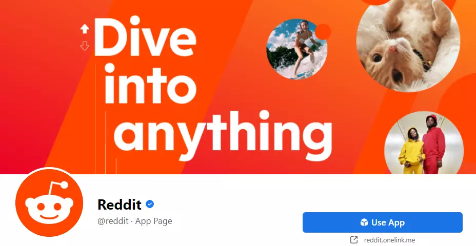
6. Make Your Facebook Cover Photo Complementary To Your Profile Photo
Your Facebook cover photo & profile photo should look like cohesive conjunction of elements. Although they are different from each other, they should not be drastically different. Ideally, they should complement each other in color, size, and contrast. You want to ensure that both the cover and profile photos look like they are part of the same brand.
7. Optimize For Mobile
How will your Facebook cover photo read on a mobile screen? Will it be clear, or is it confusing for viewers? Will any of the important brand elements be cut off? Is the text big enough? You should ask these types of questions yourself to ensure your cover photo on Facebook is optimized for mobile.
If you want your Facebook mobile app to run faster, use less data, and have a better display and graphics, try using Facebook Touch
8. Right-Align The Elements In Your Cover Photo
Although centering elements in Facebook cover photos may, in some cases, be the preferred choice, the right alignment of the heavier elements reads more aesthetically. It directs the viewer's eye from a left-to-right motion, thus landing on your Page's call-to-action button at the bottom right of your Facebook cover photo.

9. Include A Description & A Shortened Link
When uploading a Facebook cover image, you should add a caption to it. People often forget to do this & it's an ample missed opportunity if you have a call to action in your cover photo on Facebook.
To support your call to action & reduce friction for your followers, ensure to add a caption to your Facebook cover photo along with a link to where you want your followers to take action.
Follow your lead & use a shortened link to track how many clicks it gets. You can measure the engagement your Facebook cover photo and caption received in this way.
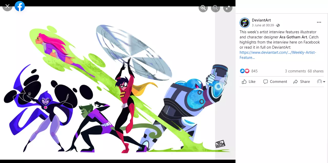
Important Read: 11 Ways To Increase Engagement On Facebook
Facebook Cover Photo Ideas
Now that you know the proper dimension of cover photos for Facebook, you may be wondering what to actually include in your Facebook cover photo. Should it be a logo or a picture or just be text? Let's dive into some ideas:
1. List Out Your Logo Or Mission Statement
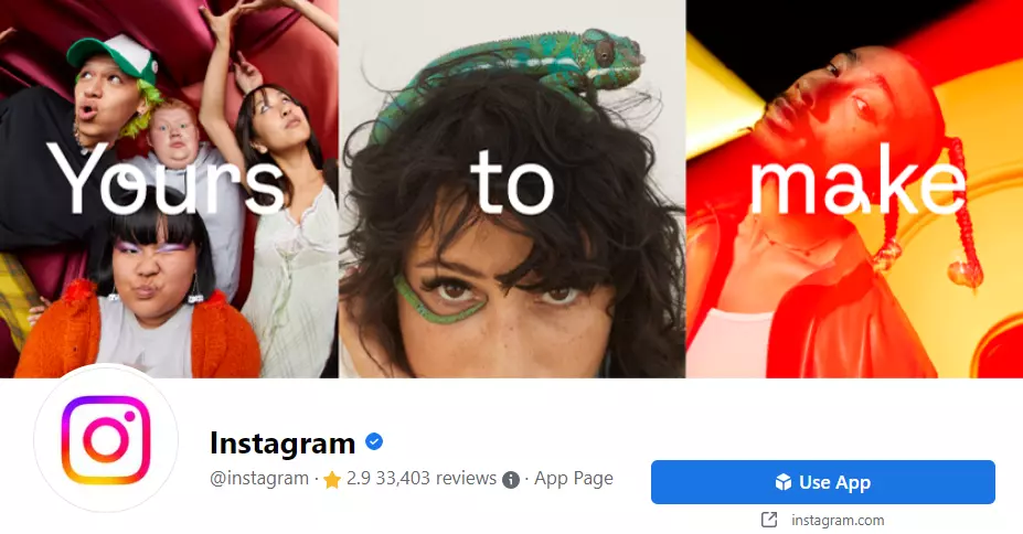
You can list out your mission statement along with your logo in your Facebook cover photos, or even just your logo or just your mission statement also. This is an excellent option for smaller businesses and new companies for the purpose of branding and also is the default option for any brand.
2. Advertise Upcoming Events
You can even use your cover photos for Facebook for advertising for an upcoming event that you may have. For instance, if there is a contest, webinar, or conference that is coming up, then you can use your Facebook cover photo to promote it and let users know about the event.
Simple Facebook cover photos, like Slack's, reinforce the brand's identity while also conveying a clean introduction to your Page. Slack users recognize its colors, and those new to Slack see a playful but simple image. That's a win-win situation for the brand.

3. Feature A User Testimonial Or Quote
You can also feature a user testimonial or a customer quote related to your product or service in your cover photos for Facebook. Social proof is very important in today's age. Showing such testimonials in your Facebook cover photo will serve as instant social proof to the users who land on your Page.
4. Demonstrate Product Features Or Benefits
A Facebook cover photo can also be used to demonstrate a product feature or benefit. For instance, if you offer a background removal tool that removes a background and makes it transparent in 3 steps, you can create a little 3-step illustration and showcase it on your cover photo for Facebook to provide a simple demo of your product to your audience.

5. Show Off Store Or Office
You can also use your Facebook cover photo to show off your store location or office space. If you own a local business, then you may want to show off your store location and its aesthetics.
For instance, if you own a local coffee shop, your cover photo for Facebook can show the inside of your coffee shop so that your users will be able to see how nice and aesthetically pleasing your shop looks, and they will even want to come inside and work or drink coffee.
6. Promote An Upcoming Product
Your cover photos for Facebook can promote an upcoming product that may be in the work. A brand that often uses this Facebook cover photo idea is Starbucks. They change their cover photo on Facebook each time a new product is going to be released to get their users excited about it.

7. Feature Team Members Or Employees
You can use your Facebook cover photo to feature your team members or employees. If your company is during a hiring surge and is looking for new employees to join your team, you may want to showcase featured team members and employees on your cover photo on Facebook.
It can even include a testimonial with your team saying how they love working at your company. Such a Facebook cover photo will humanize your business and promote the community.
But, this idea also works without the need for new hires. For instance, if you are a small business dedicated to sustainability, you may wish to showcase the employees behind your business to humanize the company and add to the brand image.
Important Read: How To Get Free Facebook Likes
Common Facebook Cover Photo Mistakes
Now that we have covered some beautiful Facebook cover photo ideas let's dive into some of the most common mistakes people make while designing good cover photos for Facebook.
1. Improper Sizing
Improper sizing is the first and very common mistake when it comes to Facebook cover photos. Most brands don't size their cover photo on Facebook properly, so they are left with a cropped or pixelated-looking cover photo. If you are a business that does this, it doesn't look very professional!
2. Too Much Text
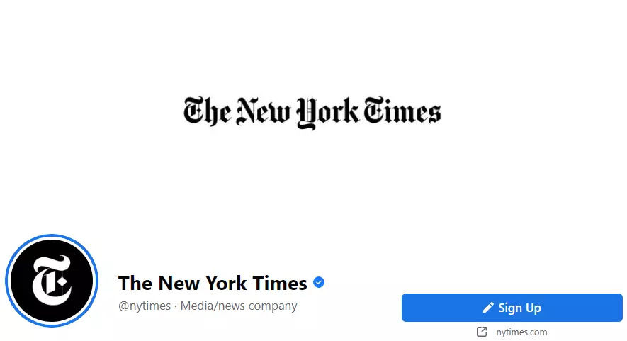
The second mistake that people make with cover photos on Facebook is having too much text on them. Text is excellent, especially if it helps further enhance your Facebook cover photo. However, having a cover photo that has lines and lines of text just like a paragraph may not be so great.
Remember, it is a cover photo, not a Facebook post with an image. You can use text to help the image, but your Facebook cover photo should be able to speak for itself.

3. Having A Cluttered Photo
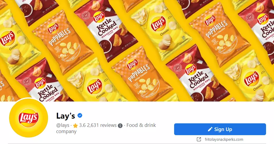
The third mistake that people make with Facebook cover photos is selecting one that is too cluttered in the sense that there are too many colors and a lot of objects to look at. A beautiful Facebook cover photo has a singular focal point that allows the people looking at it to instantly understand what to focus on.
4. Choosing Generic Cover Photo
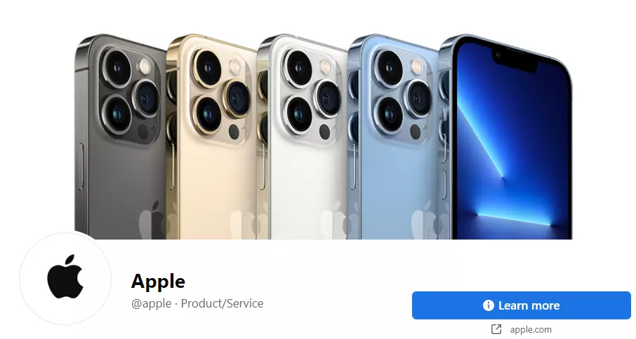
The fourth mistake that people make with Facebook cover photos is selecting a generic photo. The purpose of a cover photo on Facebook is to stand out to those viewing your Facebook page or group.
Choosing a generic image that does not enhance the story you are trying to tell with your brand or image doesn't have the same impact. This might work for personal accounts, but for business and brand accounts, selecting a generic Facebook cover photo just doesn't add to its purpose.

5. Not Aligning With Brand
On the topic of brand image, the mistake of choosing a Facebook cover photo that doesn't align with your brand is the most common one. When picking a cover photo for Facebook, you should ask yourself if the photo matches the image and personality of the brand you are trying to convey.
For instance, on a Facebook page dedicated to a wedding photography brand capturing light and glowy images, you should not pick a cover photo that is dark and bleak as it wouldn't align with your brand.
Putting It All Together
Anyone who runs a branded page on Facebook knows how essential it is to optimize every piece of real estate on it. Even the smallest detail, from the title to the reviews, is crucial to potential customers' first impression of your brand.
Facebook cover photos take up almost half of the first scroll on your Page, thus setting the tone for your Page and telling your brand's story. Your Facebook cover photo will grab attention and look super professional if done well.
A Facebook cover photo is arguably the most essential element of your Facebook page, so you will want to put in the effort to make a beautiful one to give your brand a polished and professional look.
Fortunately, creating attention grabbing Facebook cover photo for your brand's online presence isn't that hard. Just follow the tips mentioned in this guide, and you will be on your way to having a professional-looking Facebook page in no time!
Looking for a social analytics tool to track the performance of your marketing campaign? Try Statusbrew. With several ready-to-use reporting templates and total flexibility to customize these reports, Statusbrew will help you determine whether your social initiatives have led to positive results and where adjustments are needed to strengthen your marketing campaigns - in no time.
Statusbrew is an all in one social media management tool that supports Facebook, Instagram, Twitter, Linkedin, YouTube, and even Google My Business.


Explore the Statusbrew range of social media tools
Cancel anytime!