
Social media has evolved rapidly, and it has become so ingrained in everyday life that most social media network icons are easily identifiable.
Adding a social media icon to your brand’s marketing strategy offers you excellent opportunities. You can add these icons on your website home page, blog page, email, or marketing collateral.
However, social media icons are the respective company’s registered trademarks, and they are copyright protected. Before using the logos, you should be careful and consider the brand guidelines to avoid any serious legal consequences.
The social networks are constantly working on their products and often updating their design and features. The brands need to get acquainted with the current change to refrain from using incorrect social media logos and icons.
We have compiled this blog with insights on the latest social media icons and key usage guidelines to save your time and resources. Delve deep to gain an in-depth idea of using the icons in your marketing strategy without any legal consequences for your business.
- Social Media Icons For Brand Marketing
- Social Media Icons Guidelines
- How To Use Social Media Icons: Best Practices
Social Media Icons For Brand Marketing
Wondering why you should use social media icons? Social media icons enrich business discoverability as they help your target audience find your business efficiently. In a way, they help your prospects to connect with you and boost the opportunity to secure more quality leads.
You can implement the icons on your digital media marketing materials, infographics, websites, social media graphics, or real-world marketing materials. It makes your audience aware that your business is available on that social channel, and it aids your prospects in communicating with your business through those channels.
For example, you can click on the following social media icons on the Statusbrew homepage, which will take you to the organization's social media channels, respectively.
![]()
Another usage benefit of using social media icons is, it is an impactful way to keep your website neat and uniform. Users already know simply by noticing the icons what will happen when they click on a specific icon. You need not annoy your visitors with pop-ups by asking them to follow your business on those channels. Besides, it is a great way to help visitors discover new ways to connect with your business.
Icons encourage prospects for more social sharing of your content. Your site visitors can share your content with just a few clicks rather than opening a new tab and pasting the URL manually. When you add the icons on your blog pages, you can expect more content shared directly from the pages.
- It boosts your content visibility and enhances entire content marketing. For example, if you check out the Statusbrew blogs, you'll notice clickable social media share buttons with icons for every content. When you click on them, it aids you in sharing that particular content on the respective social media platforms.

-
You can use social media icons in your email signature to help your email recipient connect with your brand. In the newsletter, you can add icons linking your social media pages. You can use these icons for print marketing collateral such as business cards, brochures, company SWAG, print advertisements.
-
Implanting social icons reduces text usage, makes your design attractive and minimizes space and clutter. However, since you can't hyperlink them in print, you have to add URLs or handle usernames to direct people. For example, you can use it like @statusbrew, etc.
Social Media Icons Guidelines
As mentioned earlier, social media icons are registered trademarks. So you have to be careful in using them as they come with certain restrictions. You have to adhere to the brand guidelines while using each social media icon:
Facebook Icon And Guidelines
The 'f' logo is one of the globally recognized Facebook assets. It represents the Facebook website and the mobile app that comes under 'Meta'. You can leverage the 'f' logo to promote your brand's presence on Facebook.
![]()
Facebook Logo Guidelines
-
While using the 'f' logo design, ensure that it is blue or white. If you cannot meet the color guidelines due to technical limitations, it is advisable to stick to black and white. Never deconstruct or modify the "f" logo in any way. Do not alter the color, design, or scale.
-
While using the icon, the size should be the same as neighboring icons. And maintain its shape and proportion. Ensure to add adequate clear space in between while grouping it with other logos.
![]()
- Refrain from animating or fabricating the logo in physical form. For digital applications, use the color values HEX or RGB. For print applications, you can use two types of color values: PMS and CMYK.
Note: If you wish to use the Facebook logo for any advertising purpose such as TV, digital advertising, or print packaging, you must submit your creative to the Facebook team for review before launch.
If you are a Facebook partner or engaged on a Facebook sponsorship, you can directly communicate to Facebook contacts to get brand guidance and permission as required. For advertising on Facebook follow Facebook Ad Policy guidelines.
Resource: Facebook Brand Guidelines
Instagram Icon And Guidelines
You can download the approved Instagram icon from the asset section available in the Instagram Brand Resource Center. Ensure that the Instagram assets that you are using are taken from the Brand Resource Center site only, and you should strictly adhere to these guidelines.

Image Source: Instagram Brand Resource Center
Instagram Logo Guidelines
-
Use icons only from Instagram Brand Resource Center. From there, you can find different versions of the icon in multi-color or black and white.
-
You should use the black and white Instagram logo whenever you refer to your presence on Instagram. The multicolor icon is the 'App Icon'. You should use this icon only if you want to display it on a device with other apps or motivate people to download the Instagram app.
-
Don't alter the multi-color camera logo in any way. However, Instagram provides you the freedom to use the black and white logo in any solid color. But the other aspects of the design must remain unchanged. While using the icon, ensure to maintain its proportion and do not make it smaller than 29X29 pixels.
-
If you are planning to use the icons for broadcast or radio, print, or any advertising larger than 8.5 inches X 11 inches, you have to request permission to use the icon. All permission requests should be in English and should include a mock-up of how you intend to use the icon.
-
Ensure to avoid representing the Instagram brand in a way where you are keeping the letter "I" in Instagram capitalized, and it should be in the same font size and style as the content surrounding it.
-
Refrain from modifying abbreviations, translating the word Instagram to a different language, or using non-English characters. Don't combine "Insta" or "gram" with your own brand.
Note: You must not combine any part of the Instagram brand with a company name, other trademarks, or generic terms. While using the icon, never put the Instagram brand in a negative context, even as part of a script or storyline. You should comply with Instagram's Terms of Use and Community Guidelines.
You can mention Instagram in a television commercial with Facebook or other Facebook companies. However, a clear CTA such as “Follow us on Instagram” should accompany the glyph or the camera logo unless the icon appears in a list of other social network logos.
Resource: Instagram Brand Guidelines
Twitter Icon And Guidelines
Before using Twitter icons for your brand marketing, ensure to read Twitter Brand Guidelines precisely. For the approved logo, download it from Twitter Brand Resources. You also can download the complete guidelines for using them. Twitter’s logo is their most recognizable asset; they are protective of it.
Twitter Logo And Guidelines
-
Refrain from altering shape or form of the logo, such as skewing or rotating it, using patterns, and adding elements.
-
When you place the logo on an image, use the white version. For images with a light background, Twitter suggests applying a 10-20% black tint to the entire image. In terms of color, there are certain exceptions to the rule. You need to reach out to the Twitter team for permissions. Besides, don’t overemphasize the logo.
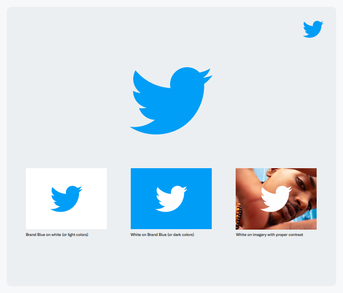
Image Source: Twitter Brand Toolkit
-
Never animate or anthropomorphize the Twitter logo. Do not surround the logo with any creatures or birds.
-
You should use only the most updated version of the logo. Twitter suggests that the size of the logo should be 16 pixels. And the safe space around the logo should be at least 150% the size of the logo itself.

Image Source: Twitter Brand Toolkit
Note: Do not add any special effect to the logo. Besides, refrain from using any other marks in a manner that suggests sponsorship or endorsement by Twitter. Do not use old logos or other elements that can confuse Twitter with another brand.
Resource: Twitter Brand Resources
LinkedIn Icon And Guidelines
LinkedIn icon and other brand features are protected by law, and you need permission to use them. You can send the permission requests to trademark@linkedin.com.
Note that LinkedIn usually does not give permissions to third-party developers, users and any media to use it’s logo, trademarks, webpages or screenshots, or any other brand features. In any of the following cases, your permission request is never approved.
![]()
Image Source: LinkedIn Brand Policies
-
LinkedIn does not allow the use of their trademarks such as LinkedIn in the name of your business, group, event, product, service, app, domain name, social media account, or other offerings.
-
You cannot use LinkedIn trademarks more prominently than your product or service name. Neither do they allow you to use the trademarks on promotional materials that you are distributing or selling.
-
Do not modify trademarks, icons and you must not or combine them with any other symbols or words, images, designs, or incorporate them into a slogan.
-
Refrain from using the icon in a way that implies affiliation with or endorsement by LinkedIn of your products or services.
Note: If you hold a partner agreement with LinkedIn, you have to seek permission to use our trademarks or brand features. However, even after receiving approval, you must adhere to its user Use Requirements and Terms.
LinkedIn Logo Guidelines
- LinkedIn's default logo is blue. It recommends using the black or white version on a solid white or black layout only. If you cannot adhere to it, you may use a white version on dark backgrounds to make the logo easily visible.

Image Source: LinkedIn Brand Policies
-
While using the icon on the marketing material, ensure to use the correct color version. You can use a solid black version regarding any color limitations in print applications.
-
The LinkedIn icon must be in a rounded square container. Ensure that it is 21 pixels tall for online applications. The logo height should be at least 0.25 (6.35mm) inches for print. Keep the area surrounding the logo is free of other elements. The minimum clear space should be the width of the ‘i’ x 2.

Resource: LinkedIn Branding Policies
YouTube Icon And Guidelines
The approved YouTube icon files are available for download at the YouTube Brand Resources page. While using YouTube icons, you should adhere to the guidelines specified by YouTube to prevent any kind of legal issue. The guidelines are stated below:
YouTube Logo Guidelines
- While using the YouTube logo, make sure to leave clear space around the logo. The space must be greater than or at least equal to the size of the triangle in the YouTube icon. The clear space around the logo gives the icon some space to breathe, thus making a more significant impact.

-
Whether you use the YouTube logo in print or digital media, make sure the logo is clear and sharp. The minimum height of the logo must be 20 dp (20 px) if used for digital media, and the minimum height of the logo for print media must be 0.125 in or 3.1 mm.
-
Any kind of modification to the YouTube logo is not allowed. You are not allowed to alter the spacing between the letters in the text, change the typeface, change the shape, and add any kind of visual effects.
YouTube logo can be used in two different color orientations. The full-color pairs the YouTube red icon with white or almost black text. The triangle in the logo must be white. The icon must be the same color as the text in the monochrome logo, i.e., either almost black or white.


Image Source: YouTube Brand Resources
The triangle in the monochrome icon should be transparent so that the background shows through. Refrain from using any color other than red, white, and almost black.
-
Do not use the logo in a sentence or a phrase.
-
YouTube should only link back to a YouTube channel.
Note: Before using any YouTube brand elements, you need special approval, and it should be submitted in English via the Brand Use Request Form for review.
Resource: YouTube Brand Resources
Snapchat Icon And Guidelines
The full Snapchat guidelines and approved ghost logo can be downloaded from Snap Inc. Before using the Snapchat logo for your personal use, make sure to read and abide by the guidelines to avoid any kind of issues that you don’t want to fall into. The guidelines to use the Ghost logo are stated below:
Snapchat Logo Guidelines
Usage of any Snapchat brand element from any third-party source is not allowed.
Don’t use any brand element that suggests endorsement, partnership, or sponsorship by Snap Inc.
-
Do not modify any part of Snapchat brand elements.
-
Ghost logo: Only use the logo in black and white color. Do not alter, modify or obstruct the logo.When using the Ghost logo with other logos, make sure it is the same size as other logos. The Ghost logo must be at least 18 px in height.
-
The logo should not be surrounded by other characters. Do not use the logo to refer to any service other than Snapchat.
-
Provide some space for the logo to breathe. The clear space around the Ghost logo must be at least of the same height and width as the Ghost logo.
Note: Use the App icon only when showing it on a mobile phone or using it in the context of mobile apps; otherwise, use the Ghost logo only.

Image Source: Snapchat Brand Guidelines
Pinterest Icon And Guidelines
To download the approved Pinterest badge, please visit the Pinterest Brand Guidelines page. Make sure to follow the guidelines while using Pinterest brand elements for your own use. The guidelines to use Pinterest brand elements are stated below:
Pinterest Logo Guidelines
- Only use the EPS and high-resolution PNG format logo available at the Pinterest Brand Guidelines. The primary Pinterest logo is in red color; however, you may also apply a contextual color approach. Do not alter the logo with image filters or effects.

Image Source: Pinterest Brand Guidelines
-
When using the logo in call to action, make sure your CTA is proportionate to the size of the logo. In this, you can use phrases like, “Get Inspired on Pinterest,” “Popular on Pinterest,” “Find us on Pinterest,” “Visit Us on Pinterest,” “Follow us on Pinterest,” and “Find more Ideas on Pinterest.”
-
Do not use phrases like “Trending Pins,” “Trending on Pinterest,” or any phrase where Pin is used as a verb.
-
The Pinterest icon on your website should always link back to your Pinterest profile.

Image Source: Pinterest Brand Guidelines
Note: To use the Pinterest brand elements in video, film, or television, you need to submit a request in writing to your partner manager at Pinterest. To avoid production delays, reach out at least ten days ahead.
Resource: Pinterest Brand Guidelines
WhatsApp Icon And Guidelines
You can download WhatsApp-approved logo files from the WhatsApp Brand Resource Page. If you intend to use WhatsApp logos for your use, make sure you adhere to the guidelines specified by WhatsApp to avoid any sort of legal issues. The guidelines to use WhatsApp brand elements are stated below:
WhatsApp Logo Guidelines
- Use WhatsApp names and logos that are available on the WhatsApp Brand Guidelines website only. Do not use names, domains, trademarks, logos, or any other content that could be perplexing with WhatsApp. When talking about WhatsApp, always use ‘W’ and ‘A’ in uppercase and do not alter the word “WhatsApp.”

Image Source: WhatsApp Brand Guidance
-
Make sure the WhatsApp word is of the same size and font style as the content surrounding it. Do not use the WhatsApp logo in a sentence or a phrase to replace the word WhatsApp.
-
Try to use the green and white WhatsApp logo whenever possible.

- You can use the black and white logo if the content is mostly black and white.

- When referring to the iOS version of the app, always use the green square logo. Do not alter the logo in any shape or form.

Image Source: WhatsApp Brand Guidance
- Do not change the color of the logo other than the allowed ones. Do not use WhatsApp Brand Resources in any way that suggests endorsement, sponsorship, or partnership by WhatsApp.
Note: You need to submit a written request if you wish to use WhatsApp Brand Resources while marketing your products or services, or you want to use them in television, broadcast, or film.
Resource: WhatsApp Brand Guidance
Tiktok Icon And Guidelines
Tiktok has bought a new wave in marketing in the form of videos. Video marketing is now an essential aspect of a brand's marketing strategy and is widely prevalent among the audience. The Tiktok logo is an edgy music note if you have noticed it. The inspiration behind the logo is rooted in how the app had created a virtual stage for so many creators worldwide.

Image Source: TikTok Brand Book
TikTok Logo Guidelines
-
While using the TikTok logo, there should not be any space between "Tik" and "Tok." Ensure that both letters "T" are upper case and all other letters lower case.
-
Refrain from modifying the logo, do not abbreviate or translate the word "TikTok" into a different language, or do not use a non-Latin alphabet. Do not abbreviate the brand name or use phonetic equivalents of the brand name like "Tiktok," "tiktok," "Tik Tok".
-
Maintain a clear space full width of the icon on all sides, do not any text or graphics within the clear space.

Image Source: TikTok Brand Book
- Adhere to the minimum size for the logo, i.e., is 3mm for print and 16 pixels for digital. If you are using the icon for small scale, ensure the icon is 60% of the container width, optically centered.

Image Source: TikTok Brand Book
- When you use the logo, ensure to follow the guidelines, like not altering the color. And while it is on your marketing materials, ensure to space it out correctly.
Note: TikTok is under a lot of pressure, including its ban in India and potential ban in the US. However, the impact of TikTok is not easy to ignore in video marketing. Before using the platform for your business, ensure to read all the social media laws of your country and make a decision whether you're going ahead with it or not.
How To Use Social Icons: Best Practices
Following are some best practices you can hold on to while using social media icons:
1. Never Do Any Alteration To The Logo
This is one of the prime factors you should focus on. You can't make alterations to any logo as they are registered trademarks. Do not change the color or rotate icons or refrain from adding any elements to it. If the logo color does not go well with your website color, you can choose a monochrome version if the brand guidelines allow.
2. Adhere To Uniform Size And Space
In CTA or grouping social media icons in your brand's marketing materials, you may require to use more than one social media icon. While using multiple icons, make sure that all icons have a uniform size and resolution. Focus on the height and width precisely. Social media companies emphasize maintaining a specific amount of clear space for icons and other elements. You should follow all the necessary requirements so that each icon has apt visibility.
3. Use It On Videos, Newsletters & Emails
Leverage the usage of the social media icons or logos in your videos, social media posts, newsletters, or collaterals to enhance its impact. It is a good practice to use icons on all brand marketing material as it helps you enrich the brand awareness across social and helps to drive more leads.
4. Focus on Placement
When you use social media icons, make sure they are placed well to get the desired impact. They should be placed in a way that is getting the attention yet not overshadowing your brand. You can use them at the bottom of your site or on sidebars. Place them in a location that is easy to locate, and users can seamlessly click on the icons with a quality page visiting experience.
Wrapping Up!!
Different social media networks have their own requirements and guidelines. Read the brand guideline precisely and blend the social media icon usage with your content strategy to drive more success. You can use this post as your essential guide while using social media logos.
Besides, to avoid further mistakes, you can rely on the Statusbrew Asset manager. It is a simplified & collaborative asset management tool that helps your team maintain a pool of the brand's digital content.

They can effectively collaborate for the next marketing campaign, and it allows you to create high-quality, engaging brand's digital content in text, image, link, or video format. Your team can swiftly choose the stored content and maintain the brand's visual identity.
Want to know more about Statusbrew? Start a free trial today!
Statusbrew is a unified Social Media Management tool that supports Facebook, Instagram, Twitter, YouTube, Linkedin, and even Google My Business!


Explore the Statusbrew range of social media tools
Cancel anytime!